Cyper
Sports
Cyper Sports is a modern sports news platform built for an engaging and clutter-free reading experience. Designed on WordPress, it prioritizes intuitive navigation, structured content, and mobile optimization. The goal was to create a seamless, ad-light platform where fans can quickly access breaking news, analysis, and trending stories without distractions.
Cyper Sports is a modern sports news platform built for an engaging and clutter-free reading experience. Designed on WordPress, it prioritizes intuitive navigation, structured content, and mobile optimization. The goal was to create a seamless, ad-light platform where fans can quickly access breaking news, analysis, and trending stories without distractions.
E-commerce
My Role
My Role
UX/UI Designer, Brand Strategist, Web Developer
UX/UI Designer, Brand Strategist, Web Developer
My Role
My Role
Date 2024 and ongoing
Date 2024 and ongoing
Cyper Sports (Sports News & Blog UX/UI Case Study)
Cyper Sports
(Sports News & Blog UX/UI Case Study)
🏈 A Fresh Take on Sports Blogging: A WordPress-Powered Fan Experience
🏈 A Fresh Take on Sports Blogging:
A WordPress-Powered Fan Experience
What I Did:
Designed & built a sports news website focused on engaging layouts & easy navigation.
Used WordPress to create a scalable & SEO-friendly blog platform.
Developed a custom sports brand identity with a modern, dynamic look.
Prioritized UX/UI for sports fans, ensuring content is easy to read & interact with.
The Problem
Most sports news websites are cluttered, ad-heavy, and difficult to navigate, making it hard for fans to quickly find relevant content. Slow load times, excessive visuals, and buried articles reduce engagement. The challenge was to design a clean, structured, and user-friendly platform that delivers sports updates seamlessly.
Most sports news websites are cluttered, ad-heavy, and difficult to navigate, making it hard for fans to quickly find relevant content. Slow load times, excessive visuals, and buried articles reduce engagement. The challenge was to design a clean, structured, and user-friendly platform that delivers sports updates seamlessly.
Most sports news websites are cluttered, ad-heavy, and difficult to navigate, making it hard for fans to quickly find relevant content. Slow load times, excessive visuals, and buried articles reduce engagement. The challenge was to design a clean, structured, and user-friendly platform that delivers sports updates seamlessly.
The Solution
✔️ A structured, visually engaging UI with distinct content sections.
✔️ SEO-optimized article layouts for better discoverability.
✔️ A custom WordPress theme that allows for easy content updates.
✔️ User-centric design with clear navigation, high-quality imagery, and a strong
✔️ A structured, visually engaging UI with distinct content sections.
✔️ SEO-optimized article layouts for better discoverability.
✔️ A custom WordPress theme that allows for easy content updates.
✔️ User-centric design with clear navigation, high-quality imagery, and a strong
✔️ A structured, visually engaging UI with distinct content sections.
✔️ SEO-optimized article layouts for better discoverability.
✔️ A custom WordPress theme that allows for easy content updates.
✔️ User-centric design with clear navigation, high-quality imagery, and a strong
What I Actually Did Under the Hood
Most sports news websites are cluttered, ad-heavy, and difficult to navigate, making it hard for fans to quickly find relevant content. Slow load times, excessive visuals, and buried articles reduce engagement. The challenge was to design a clean, structured, and user-friendly platform that delivers sports updates seamlessly.
Most sports news websites are cluttered, ad-heavy, and difficult to navigate, making it hard for fans to quickly find relevant content. Slow load times, excessive visuals, and buried articles reduce engagement. The challenge was to design a clean, structured, and user-friendly platform that delivers sports updates seamlessly.
Most sports news websites are cluttered, ad-heavy, and difficult to navigate, making it hard for fans to quickly find relevant content. Slow load times, excessive visuals, and buried articles reduce engagement. The challenge was to design a clean, structured, and user-friendly platform that delivers sports updates seamlessly.
Security & Optimization
Added custom PHP snippets to
block spammy website URLs
bot-like usernames
Set up Cloudflare WAF rules to
block known VPNs, botnet IPs,
and suspicious traffic
Rate-limited repeated requests to
/sidebar and other spammed paths
Changed WordPress login to
/gm-back-door-login and
disabled public registration
Performance & Analytics
Enabled long-term browser caching
(1 year) for JS, CSS, images,
and media
Activated Rocket Loader and
SpeedBrain in Cloudflare
for script optimization
Set up Google Analytics to
monitor site traffic and user behavior
Used Hummingbird + Cloudflare
together for optimal cache control
site ranks 94 on pingdom
Custom Design & UX
Designed blog post graphics
and UI elements using Photoshop
and Illustrator
Sketched low-fidelity layouts to plan
the site structure before building,
a Wordpress Lite Theme
Customized block-based layout
WordPress to avoid premium themes
Branded the experience to match
the Cyper Sports voice and vibe,
w/differentiating from competition
Overview
🛠 WordPress Development • UX/UI Design • Custom Plugin Tweaks (PHP) • Photoshop • Branding • SEO Optimization • Cloudflare Security • Google Analytics
🔗 Live Project: Cyper Sports
🛠 WordPress Development • UX/UI Design • Custom Plugin Tweaks (PHP) • Photoshop • Branding • SEO Optimization • Cloudflare Security • Google Analytics
🔗 Live Project: Cyper Sports
Low-Fidelity
Low-Fidelity
After sketching out the overall structure of CyperSports, I jumped into Figma to start building out the low-fidelity mockups. My goal here wasn’t to focus on colors or imagery—it was more about mapping out the layout, structure, and how the content would guide users through the page. I kept things minimal, using greyscale boxes and placeholder text to visualize the flow.
After sketching out the overall structure of CyperSports, I jumped into Figma to start building out the low-fidelity mockups. My goal here wasn’t to focus on colors or imagery—it was more about mapping out the layout, structure, and how the content would guide users through the page. I kept things minimal, using greyscale boxes and placeholder text to visualize the flow.
After sketching out the overall structure of CyperSports, I jumped into Figma to start building out the low-fidelity mockups. My goal here wasn’t to focus on colors or imagery—it was more about mapping out the layout, structure, and how the content would guide users through the page. I kept things minimal, using greyscale boxes and placeholder text to visualize the flow.
Once I felt confident in the structure, I transitioned into high-fidelity mockups. That’s when I started layering in the visual identity—brand colors, fonts, actual images, and UI details that matched the tone of the site. The high-fidelity versions helped bring the concept to life and gave me a clear sense of how the final design would feel.
Once I felt confident in the structure, I transitioned into high-fidelity mockups. That’s when I started layering in the visual identity—brand colors, fonts, actual images, and UI details that matched the tone of the site. The high-fidelity versions helped bring the concept to life and gave me a clear sense of how the final design would feel.
Once I felt confident in the structure, I transitioned into high-fidelity mockups. That’s when I started layering in the visual identity—brand colors, fonts, actual images, and UI details that matched the tone of the site. The high-fidelity versions helped bring the concept to life and gave me a clear sense of how the final design would feel.

Low-Fidelity Mockup – Layout Planning
This version focused strictly on layout and spacing. It was helpful for testing structure and making quick changes before investing time into final design elements.

High-Fidelity Mockup – Final Visual Direction
This mockup incorporated color, real content, and branding elements. It reflects the look and feel of the final product and set the foundation for the development handoff.
Tools: Google Docs, Figma
Tools: Google Docs, Figma
All of the mockups were created in Figma. It’s my go-to tool for visual design and prototyping. I like how easy it is to experiment with layout ideas and quickly switch from low-fidelity to polished mockups. It made the whole process fast and fluid without ever feeling locked in. I used Figma’s auto layout and grid system to keep things consistent and aligned, which helped speed things up when refining the high-fidelity version.
All of the mockups were created in Figma. It’s my go-to tool for visual design and prototyping. I like how easy it is to experiment with layout ideas and quickly switch from low-fidelity to polished mockups. It made the whole process fast and fluid without ever feeling locked in. I used Figma’s auto layout and grid system to keep things consistent and aligned, which helped speed things up when refining the high-fidelity version.
All of the mockups were created in Figma. It’s my go-to tool for visual design and prototyping. I like how easy it is to experiment with layout ideas and quickly switch from low-fidelity to polished mockups. It made the whole process fast and fluid without ever feeling locked in. I used Figma’s auto layout and grid system to keep things consistent and aligned, which helped speed things up when refining the high-fidelity version.
Hardening Cyper Sports Against WordPress Spam Attacks
Hardening Cyper Sports Against WordPress Spam Attacks
Overview
Overview
Overview
If you’ve ever worked in WordPress, you know spam is inevitable — and no, we’re not talking about the canned kind. From random form submissions to comment section chaos, the bots will find you. With Cyper Sports, the challenge wasn’t just stopping spam, it was building a clean, fast, and secure foundation without overcomplicating things.
If you’ve ever worked in WordPress, you know spam is inevitable — and no, we’re not talking about the canned kind. From random form submissions to comment section chaos, the bots will find you. With Cyper Sports, the challenge wasn’t just stopping spam, it was building a clean, fast, and secure foundation without overcomplicating things.
If you’ve ever worked in WordPress, you know spam is inevitable — and no, we’re not talking about the canned kind. From random form submissions to comment section chaos, the bots will find you. With Cyper Sports, the challenge wasn’t just stopping spam, it was building a clean, fast, and secure foundation without overcomplicating things.
Challenge
Challenge
Challenge
We began noticing spam content arriving via unknown entry points — even though no visible contact forms were active. WordPress comment forms and vulnerable endpoints like /wp-comments-post.php or login pages are often targeted by bots. And we wanted to stay ahead of them.
We began noticing spam content arriving via unknown entry points — even though no visible contact forms were active. WordPress comment forms and vulnerable endpoints like /wp-comments-post.php or login pages are often targeted by bots. And we wanted to stay ahead of them.
We began noticing spam content arriving via unknown entry points — even though no visible contact forms were active. WordPress comment forms and vulnerable endpoints like /wp-comments-post.php or login pages are often targeted by bots. And we wanted to stay ahead of them.
We began noticing spam content arriving via unknown entry points — even though no visible contact forms were active. WordPress comment forms and vulnerable endpoints like /wp-comments-post.php or login pages are often targeted by bots. And we wanted to stay ahead of them.
We began noticing spam content arriving via unknown entry points — even though no visible contact forms were active. WordPress comment forms and vulnerable endpoints like /wp-comments-post.php or login pages are often targeted by bots. And we wanted to stay ahead of them.
We began noticing spam content arriving via unknown entry points — even though no visible contact forms were active. WordPress comment forms and vulnerable endpoints like /wp-comments-post.php or login pages are often targeted by bots. And we wanted to stay ahead of them.
Actions Taken
Actions Taken
Actions Taken
Cloudflare Firewall Rules
Created targeted WAF rules to block traffic from certain countries and common spam IP sources (intentionally kept vague).
Added JavaScript Challenges to known vulnerable routes like
/wp-login.phpand/sidebar.Enabled Bot Fight Mode and disabled verified AI bots (to stop scrapers and crawlers).
Cloudflare Optimization
Set a custom Edge Cache TTL and enabled Rocket Loader for speed.
Added a page rule to cache everything on the homepage for better performance.
Turned on Brotli compression (enabled by default on free plans).
WordPress Plugin Stack
Installed Antispam Bee and configured it to block comments by language, country, and regular expressions.
Installed Disable Comments to completely shut down native WordPress commenting system site-wide.
Installed WPS Hide Login to move the login page to a unique, non-standard URL.
Regex + PHP Hardening
Added a custom PHP snippet to block spam based on URL patterns in the "Website" field.
Used regex to detect and block bot-generated gibberish names.
Other Enhancements
Turned off user registration in WordPress.
Auto-closed comments on posts older than 7 days.
Cleaned up sidebars and removed any legacy comment submission areas or widgets.

Cloudflare WAF in action – silently filtering out junk traffic daily.
This screenshot from Cloudflare’s dashboard highlights the custom Web Application Firewall (WAF) rules implemented for Cyper Sports. Each rule plays a role in hardening the site’s security — from blocking spam bots and known VPN IPs to limiting access to high-traffic paths like the sidebar. This setup was key to reducing comment spam and improving performance without needing a paid Cloudflare plan.
Result
Result
Result
With this layered setup in place, spam dropped off sharply. The site is now secure, faster, and easier to manage. Instead of relying on one plugin, Cyper Sports uses a multi-layered defense that combines DNS-level protection (Cloudflare) with in-dashboard WordPress filtering.
With this layered setup in place, spam dropped off sharply. The site is now secure, faster, and easier to manage. Instead of relying on one plugin, Cyper Sports uses a multi-layered defense that combines DNS-level protection (Cloudflare) with in-dashboard WordPress filtering.
With this layered setup in place, spam dropped off sharply. The site is now secure, faster, and easier to manage. Instead of relying on one plugin, Cyper Sports uses a multi-layered defense that combines DNS-level protection (Cloudflare) with in-dashboard WordPress filtering.
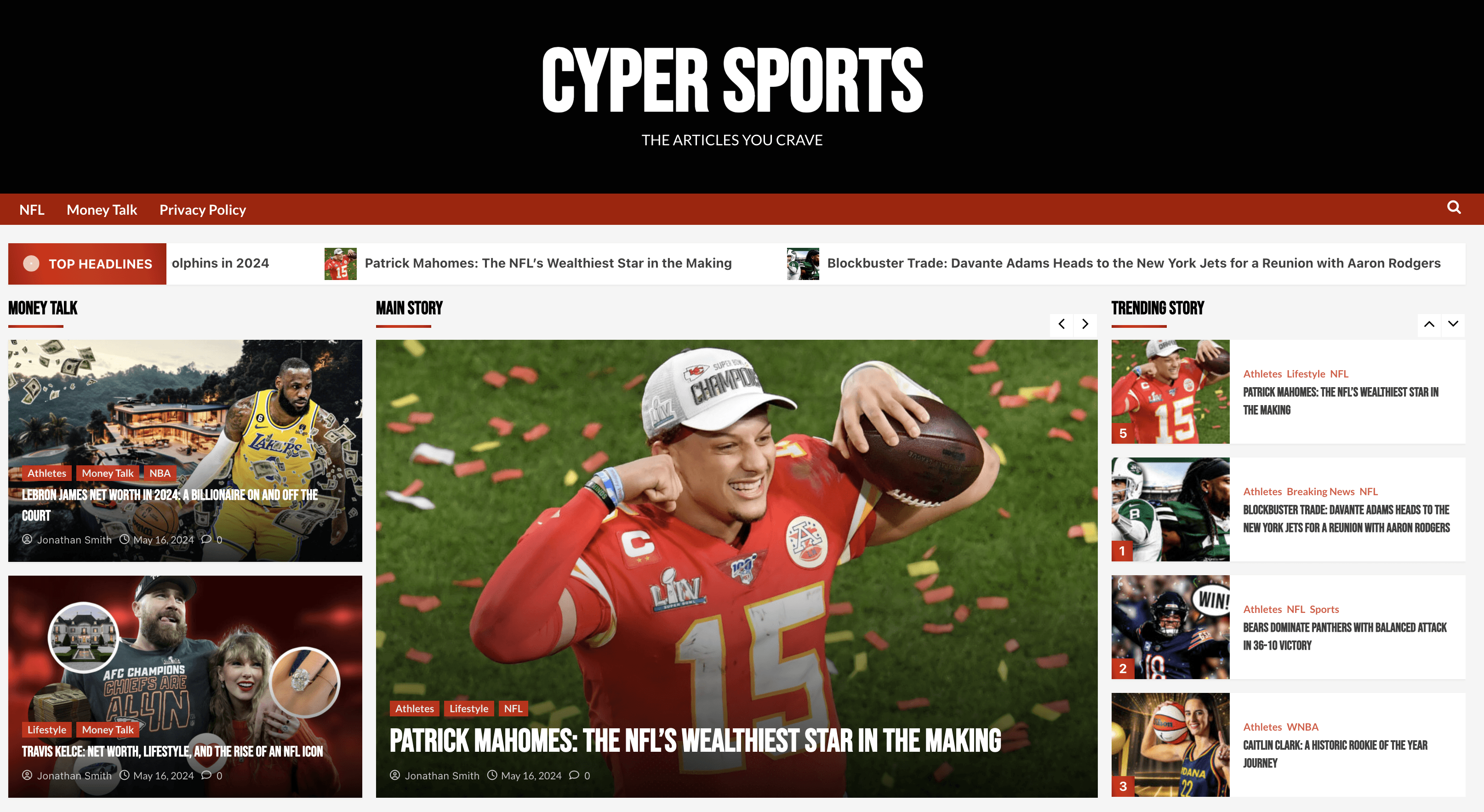
Project Overview
Project Overview
CyperSports is a fictional sports blog I created to show how I’d design for a content-heavy platform. I wanted it to feel like a site you’d visit for sharp commentary, updates, and engaging articles across different sports. The tone is casual, but the layout is structured—balancing personality with clarity.
CyperSports is a fictional sports blog I created to show how I’d design for a content-heavy platform. I wanted it to feel like a site you’d visit for sharp commentary, updates, and engaging articles across different sports. The tone is casual, but the layout is structured—balancing personality with clarity.
CyperSports is a fictional sports blog I created to show how I’d design for a content-heavy platform. I wanted it to feel like a site you’d visit for sharp commentary, updates, and engaging articles across different sports. The tone is casual, but the layout is structured—balancing personality with clarity.
The project gave me a chance to explore how to build a strong homepage experience for a media-driven site. I thought about how users would scroll, what kind of content they’d expect to see first, and how to break things up visually to keep people engaged. From hero banners to article cards and CTAs, every section is built to create flow and keep readers exploring.
The project gave me a chance to explore how to build a strong homepage experience for a media-driven site. I thought about how users would scroll, what kind of content they’d expect to see first, and how to break things up visually to keep people engaged. From hero banners to article cards and CTAs, every section is built to create flow and keep readers exploring.
The project gave me a chance to explore how to build a strong homepage experience for a media-driven site. I thought about how users would scroll, what kind of content they’d expect to see first, and how to break things up visually to keep people engaged. From hero banners to article cards and CTAs, every section is built to create flow and keep readers exploring.

© 2025 Chris Puncekar, All Rights Reserved