Elements
Trade
Elements Trade is an eCommerce website focused on lighting and home decor products. The company is based on the East Coast and serves both consumers and trade professionals. My goal was to redesign their outdated website to improve usability, clarity, and conversions.
Elements Trade is an eCommerce website focused on lighting and home decor products. The company is based on the East Coast and serves both consumers and trade professionals. My goal was to redesign their outdated website to improve usability, clarity, and conversions.
My Role
My Role
My Role
UX/UI Designer, Brand Strategist, Web Developer
UX/UI Designer, Brand Strategist, Web Developer
UX/UI Designer, Brand Strategist, Web Developer
Project Dates
Project Dates
Project Dates
Date 2022 and ongoing
Date 2022 and ongoing
Date 2022 and ongoing
Collaborated Directly
Collaborated Directly
Collaborated Directly
Stakeholders for feedback and approvals
Stakeholders for feedback and approvals
Stakeholders for feedback and approvals
Elements Trade (UX/UI Case Study)
Elements Trade (UX/UI Case Study)
💡 Redesigning an Outdated eCommerce Experience for Modern Shoppers
💡 Redesigning an Outdated eCommerce
Experience for Modern Shoppers
What I Did:
Audited the original site and identified key UX issues, including poor navigation and lack of hierarchy
Created a revised sitemap and improved category structure for better discoverability
Designed wireframes with a mobile-first approach to optimize for responsiveness
Developed clean, modern UI layouts using Adobe Creative Suite
Highlighted the Trade Professional Program with dedicated callouts and CTAs
Improved visual trust and reduced cognitive load across product and landing pages

The Problem
The original Elements Trade website suffered from poor navigation and a lack of clear visual hierarchy, making it difficult for users to browse product categories or find key information. The design felt outdated and was not optimized for mobile devices, leading to a disjointed experience across platforms. Additionally, there was little to no emphasis on the company’s Trade Professional Program or promotional offerings, missing key opportunities to engage their target audience and drive conversions.
The original Elements Trade website suffered from poor navigation and a lack of clear visual hierarchy, making it difficult for users to browse product categories or find key information. The design felt outdated and was not optimized for mobile devices, leading to a disjointed experience across platforms. Additionally, there was little to no emphasis on the company’s Trade Professional Program or promotional offerings, missing key opportunities to engage their target audience and drive conversions.
The Solution
✔️ Simplified navigation and improved hierarchy for faster browsing and reduced bounce rates
✔️ Simplified navigation and improved hierarchy for faster browsing and reduced bounce rates
✔️ Highlighted Trade Professional Program with dedicated CTAs and informative callouts
✔️ Designed with scalability in mind for future promotions, new categories, or seasonal updates
✔️ Simplified navigation and improved hierarchy for faster browsing and reduced bounce rates
✔️ Simplified navigation and improved hierarchy for faster browsing and reduced bounce rates
✔️ Highlighted Trade Professional Program with dedicated CTAs and informative callouts
✔️ Designed with scalability in mind for future promotions, new categories, or seasonal updates
Skills Used:
🛠 UX/UI Design • Photoshop • Branding • HTML • CSS • JS • Bootstrap • PS • XD • SEO Optimization
🛠 UX/UI Design • Photoshop • Branding • HTML • CSS • JS • Bootstrap • PS • XD • SEO Optimization
🛠 UX/UI Design • Photoshop • Branding • HTML • CSS • JS • Bootstrap • PS • XD • SEO Optimization
Site Map & Navigation Strategy
To redesign the Elements Trade website with clarity and conversion in mind, I began by mapping out the full site structure. My focus was to improve the overall flow, simplify navigation, and create clear pathways for both consumer shoppers and trade professionals. I avoided early distractions like color or imagery and instead used basic wireframes and flowcharts to validate the user journey. Emphasis was placed on clear entry points for key pages like the Trade Program, NY Showroom, and Product Catalog.
To redesign the Elements Trade website with clarity and conversion in mind, I began by mapping out the full site structure. My focus was to improve the overall flow, simplify navigation, and create clear pathways for both consumer shoppers and trade professionals. I avoided early distractions like color or imagery and instead used basic wireframes and flowcharts to validate the user journey. Emphasis was placed on clear entry points for key pages like the Trade Program, NY Showroom, and Product Catalog.
Once the structure felt solid, I moved into high-fidelity mockups that layered in the visual system—brand colors, product photography, and typography. This transition helped bridge the gap between strategy and design, aligning the user experience with business goals like showcasing trade opportunities and driving product discovery. The new layout made it easier for users to find what they were looking for while encouraging engagement through refined call-to-action placements.
Once the structure felt solid, I moved into high-fidelity mockups that layered in the visual system—brand colors, product photography, and typography. This transition helped bridge the gap between strategy and design, aligning the user experience with business goals like showcasing trade opportunities and driving product discovery. The new layout made it easier for users to find what they were looking for while encouraging engagement through refined call-to-action placements.

Site Map
This mockup incorporated color, real content, and branding elements. It reflects the look and feel of the final product and set the foundation for the development handoff.
Tools: Figma, Google Docs
All mockups and flows were created in Figma, which allowed for fast iterations from low-fidelity to high-fidelity designs. I used auto layout and component libraries to stay efficient and consistent across pages. The grid system helped ensure precise spacing, and I documented each flow in Google Docs for stakeholder feedback. This setup allowed for seamless updates and ensured the final visuals were aligned with development-ready specs.
All mockups and flows were created in Figma, which allowed for fast iterations from low-fidelity to high-fidelity designs. I used auto layout and component libraries to stay efficient and consistent across pages. The grid system helped ensure precise spacing, and I documented each flow in Google Docs for stakeholder feedback. This setup allowed for seamless updates and ensured the final visuals were aligned with development-ready specs.
Low-Fidelity / High Fidelity Mockups
After sketching out the overall structure of CyperSports, I jumped into Figma to start building out the low-fidelity mockups. My goal here wasn’t to focus on colors or imagery—it was more about mapping out the layout, structure, and how the content would guide users through the page. I kept things minimal, using greyscale boxes and placeholder text to visualize the flow.
After sketching out the overall structure of CyperSports, I jumped into Figma to start building out the low-fidelity mockups. My goal here wasn’t to focus on colors or imagery—it was more about mapping out the layout, structure, and how the content would guide users through the page. I kept things minimal, using greyscale boxes and placeholder text to visualize the flow.
Once I felt confident in the structure, I transitioned into high-fidelity mockups. That’s when I started layering in the visual identity—brand colors, fonts, actual images, and UI details that matched the tone of the site. The high-fidelity versions helped bring the concept to life and gave me a clear sense of how the final design would feel.
Once I felt confident in the structure, I transitioned into high-fidelity mockups. That’s when I started layering in the visual identity—brand colors, fonts, actual images, and UI details that matched the tone of the site. The high-fidelity versions helped bring the concept to life and gave me a clear sense of how the final design would feel.
Low-Fidelity Mockup – Layout Planning
This version focused strictly on layout and spacing. It was helpful for testing structure and making quick changes before investing time into final design elements.

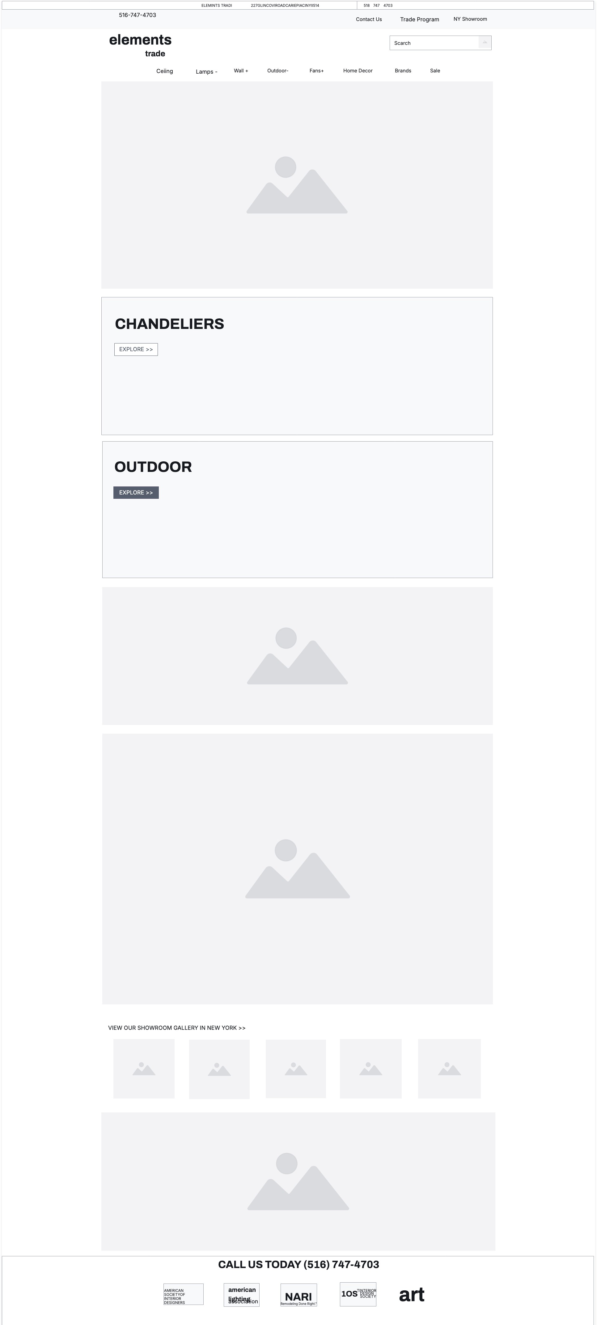
High-Fidelity Mockup – Final Visual Direction
This mockup incorporated color, real content, and branding elements. It reflects the look and feel of the final product and set the foundation for the development handoff.
Tools: Figma, Google Docs
All of the mockups were created in Figma. It’s my go-to tool for visual design and prototyping. I like how easy it is to experiment with layout ideas and quickly switch from low-fidelity to polished mockups. It made the whole process fast and fluid without ever feeling locked in. I used Figma’s auto layout and grid system to keep things consistent and aligned, which helped speed things up when refining the high-fidelity version.
All of the mockups were created in Figma. It’s my go-to tool for visual design and prototyping. I like how easy it is to experiment with layout ideas and quickly switch from low-fidelity to polished mockups. It made the whole process fast and fluid without ever feeling locked in. I used Figma’s auto layout and grid system to keep things consistent and aligned, which helped speed things up when refining the high-fidelity version.
Project Summary
The Elements Trade redesign was a full-scale UX/UI project focused on improving the eCommerce experience for a company specializing in lighting and home decor. The original website lacked clarity, visual hierarchy, and responsiveness—making it difficult for users to browse, shop, or engage with the Trade Professional Program. My goal was to modernize the look and feel, streamline the user journey, and increase conversions by addressing pain points in both navigation and content structure.
The Elements Trade redesign was a full-scale UX/UI project focused on improving the eCommerce experience for a company specializing in lighting and home decor. The original website lacked clarity, visual hierarchy, and responsiveness—making it difficult for users to browse, shop, or engage with the Trade Professional Program. My goal was to modernize the look and feel, streamline the user journey, and increase conversions by addressing pain points in both navigation and content structure.
Through thoughtful information architecture, mobile-first wireframes, and polished UI design, I created a modern, intuitive experience tailored to both consumers and trade professionals. Key updates included a revised navigation system, product categorization improvements, and a stronger visual focus on promotional areas like the Trade Program. The final design successfully increased engagement, built visual trust, and laid the groundwork for future content and seasonal campaigns.
Through thoughtful information architecture, mobile-first wireframes, and polished UI design, I created a modern, intuitive experience tailored to both consumers and trade professionals. Key updates included a revised navigation system, product categorization improvements, and a stronger visual focus on promotional areas like the Trade Program. The final design successfully increased engagement, built visual trust, and laid the groundwork for future content and seasonal campaigns.
While the desktop version is featured here, I was also responsible for coding the mobile-responsive design using HTML, CSS, and JavaScript, ensuring consistency and accessibility across devices. Using insights from Google Analytics, I made improvements to site performance and product discovery based on real user behavior. My role spanned UX strategy, UI design, and hands-on front-end development throughout the project lifecycle.
While the desktop version is featured here, I was also responsible for coding the mobile-responsive design using HTML, CSS, and JavaScript, ensuring consistency and accessibility across devices. Using insights from Google Analytics, I made improvements to site performance and product discovery based on real user behavior. My role spanned UX strategy, UI design, and hands-on front-end development throughout the project lifecycle.

This is one of a few case studies from the 400+ branded eCommerce websites I helped design during my time at Lights America. Due to NDAs and out of respect for past clients, only select projects are shared publicly.
© 2025 Chris Puncekar, All Rights Reserved