Kendall
Lighting
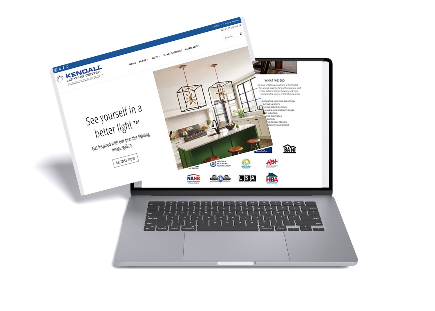
Kendall Lighting Center is a Midwest-based eCommerce brand focused on residential and commercial lighting. The goal of this project was to redesign their website to better showcase their product offerings, highlight their showroom presence, and maintain consistent branding across all touchpoints.
Kendall Lighting Center is a Midwest-based eCommerce brand focused on residential and commercial lighting. The goal of this project was to redesign their website to better showcase their product offerings, highlight their showroom presence, and maintain consistent branding across all touchpoints.
My Role
My Role
UX/UI Designer
Front-End Developer
UX/UI Designer
Front-End Developer
Project Dates
Project Dates
Date 2019 and ongoing
Date 2019 and ongoing
Collaborated Directly
Collaborated Directly
Worked with developers and client teams
Worked with developers and client teams
Kendall Lighting (UX/UI Case Study)
Kendall Lighting
(UX/UI Case Study)
💡 Redesigning an Outdated eCommerce Experience for Modern Shoppers
💡 Redesigning an Outdated
eCommerce Experience for Modern Shoppers
I collaborated closely with the client’s in-house marketing team to gather assets, align on brand tone, and ensure visual consistency across the site. At the same time, I partnered with internal developers to build a custom product catalog experience tailored to their inventory structure. This included planning the layout, improving content flow, and integrating hand-coded features like a custom Instagram image gallery to enhance engagement.
What I Did:
Collaborated with the client’s in-house marketing team to gather assets and maintain visual consistency
Partnered with internal developers to build a custom product catalog experience
Designed a custom Instagram image gallery using HTML, CSS, and JavaScript — no API, fully hand-coded
Created wireframes with a mobile-first mindset to ensure responsiveness and usability
Developed clean, modern UI layouts using Adobe Creative Suite
Developed polished UI layouts using Adobe XD and Photoshop
Streamlined category layout and callouts to improve browsing and product discoverability
Ensured alignment with brand identity across all pages and content types
The Problem
The original Elements Trade website suffered from poor navigation and a lack of clear visual hierarchy, making it difficult for users to browse product categories or find key information. The design felt outdated and was not optimized for mobile devices, leading to a disjointed experience across platforms. Additionally, there was little to no emphasis on the company’s Trade Professional Program or promotional offerings, missing key opportunities to engage their target audience and drive conversions.
The original Elements Trade website suffered from poor navigation and a lack of clear visual hierarchy, making it difficult for users to browse product categories or find key information. The design felt outdated and was not optimized for mobile devices, leading to a disjointed experience across platforms. Additionally, there was little to no emphasis on the company’s Trade Professional Program or promotional offerings, missing key opportunities to engage their target audience and drive conversions.
The original Elements Trade website suffered from poor navigation and a lack of clear visual hierarchy, making it difficult for users to browse product categories or find key information. The design felt outdated and was not optimized for mobile devices, leading to a disjointed experience across platforms. Additionally, there was little to no emphasis on the company’s Trade Professional Program or promotional offerings, missing key opportunities to engage their target audience and drive conversions.
The Solution
I redesigned the site with a clean, mobile-first layout and created a structured product catalog using HTML, CSS, and JavaScript. I collaborated with developers to build a custom browsing experience and implemented a stylized image gallery featuring the client’s Instagram content—coded without an API. The design emphasized whitespace, clarity, and product discoverability while maintaining a cohesive brand identity.
I redesigned the site with a clean, mobile-first layout and created a structured product catalog using HTML, CSS, and JavaScript. I collaborated with developers to build a custom browsing experience and implemented a stylized image gallery featuring the client’s Instagram content—coded without an API. The design emphasized whitespace, clarity, and product discoverability while maintaining a cohesive brand identity.
I redesigned the site with a clean, mobile-first layout and created a structured product catalog using HTML, CSS, and JavaScript. I collaborated with developers to build a custom browsing experience and implemented a stylized image gallery featuring the client’s Instagram content—coded without an API. The design emphasized whitespace, clarity, and product discoverability while maintaining a cohesive brand identity.
Skills / Tools Used:
🛠 UX/UI Design • Responsive Web Design • HTML5 • CSS3 • JavaScript (Vanilla) • Bootstrap • SEO Optimization • Wireframing • Adobe XD • Adobe Photoshop • Branding & Visual Design • Custom Image Gallery Development • Proprietary Issue Tracking System • Cross-Team Collaboration
🛠 UX/UI Design • Responsive Web Design • HTML5 • CSS3 • JavaScript (Vanilla) • Bootstrap • SEO Optimization • Wireframing • Adobe XD • Adobe Photoshop • Branding & Visual Design • Custom Image Gallery Development • Proprietary Issue Tracking System • Cross-Team Collaboration
🛠 UX/UI Design • Responsive Web Design • HTML5 • CSS3 • JavaScript (Vanilla) • Bootstrap • SEO Optimization • Wireframing • Adobe XD • Adobe Photoshop • Branding & Visual Design • Custom Image Gallery Development • Proprietary Issue Tracking System • Cross-Team Collaboration
Homepage Content Planning: Client-Led Mind Map
Homepage Content Planning:
Client-Led Mind Map
To kick off the homepage design, I collaborated closely with the client to identify the most important elements they wanted to highlight. Using Miro, I created a mind map to visually organize those ideas—focusing on areas like featured imagery, promoted product categories, a strong CTA, and a custom-coded Instagram image gallery. This exercise helped align everyone early in the process and made it easier to transition into wireframes with clear priorities.
To kick off the homepage design, I collaborated closely with the client to identify the most important elements they wanted to highlight. Using Miro, I created a mind map to visually organize those ideas—focusing on areas like featured imagery, promoted product categories, a strong CTA, and a custom-coded Instagram image gallery. This exercise helped align everyone early in the process and made it easier to transition into wireframes with clear priorities.
To kick off the homepage design, I collaborated closely with the client to identify the most important elements they wanted to highlight. Using Miro, I created a mind map to visually organize those ideas—focusing on areas like featured imagery, promoted product categories, a strong CTA, and a custom-coded Instagram image gallery. This exercise helped align everyone early in the process and made it easier to transition into wireframes with clear priorities.

Client-Driven Mind Map
This mind map was created during early discussions with the client to outline key content areas for the homepage. It helped visualize priorities like featured products, a custom Instagram gallery, and strategic call-to-actions before moving into layout design.
Tools & Collaboration: Miro – for visual brainstorming and mapping client ideas • Client Discovery Calls – to gather homepage content goals •Internal Team Discussions – to validate layout and development feasibility
Tools & Collaboration: Miro – for visual brainstorming and mapping client ideas • Client Discovery Calls – to gather homepage content goals •Internal Team Discussions – to validate layout and development feasibility
Tools & Collaboration: Miro – for visual brainstorming and mapping client ideas • Client Discovery Calls – to gather homepage content goals •Internal Team Discussions – to validate layout and development feasibility
The mind map was created in Miro during the early discovery phase. It helped translate abstract client feedback into a clear visual hierarchy, setting the foundation for the homepage wireframe.
The mind map was created in Miro during the early discovery phase. It helped translate abstract client feedback into a clear visual hierarchy, setting the foundation for the homepage wireframe.
The mind map was created in Miro during the early discovery phase. It helped translate abstract client feedback into a clear visual hierarchy, setting the foundation for the homepage wireframe.
Site Map & Page Architecture for Kendall Lighting
Site Map & Page Architecture
for Kendall Lighting
This site map was created to define the core structure of the Kendall Lighting website before moving into wireframes. It outlines the full page hierarchy, from the homepage and product catalog to supporting content like the showroom, trade program, and contact page. Working closely with the marketing team, I used this visual layout to align everyone on content priorities, user navigation paths, and overall site flow. This helped bridge the gap between discovery and design while setting the foundation for development.
This site map was created to define the core structure of the Kendall Lighting website before moving into wireframes. It outlines the full page hierarchy, from the homepage and product catalog to supporting content like the showroom, trade program, and contact page. Working closely with the marketing team, I used this visual layout to align everyone on content priorities, user navigation paths, and overall site flow. This helped bridge the gap between discovery and design while setting the foundation for development.
This site map was created to define the core structure of the Kendall Lighting website before moving into wireframes. It outlines the full page hierarchy, from the homepage and product catalog to supporting content like the showroom, trade program, and contact page. Working closely with the marketing team, I used this visual layout to align everyone on content priorities, user navigation paths, and overall site flow. This helped bridge the gap between discovery and design while setting the foundation for development.
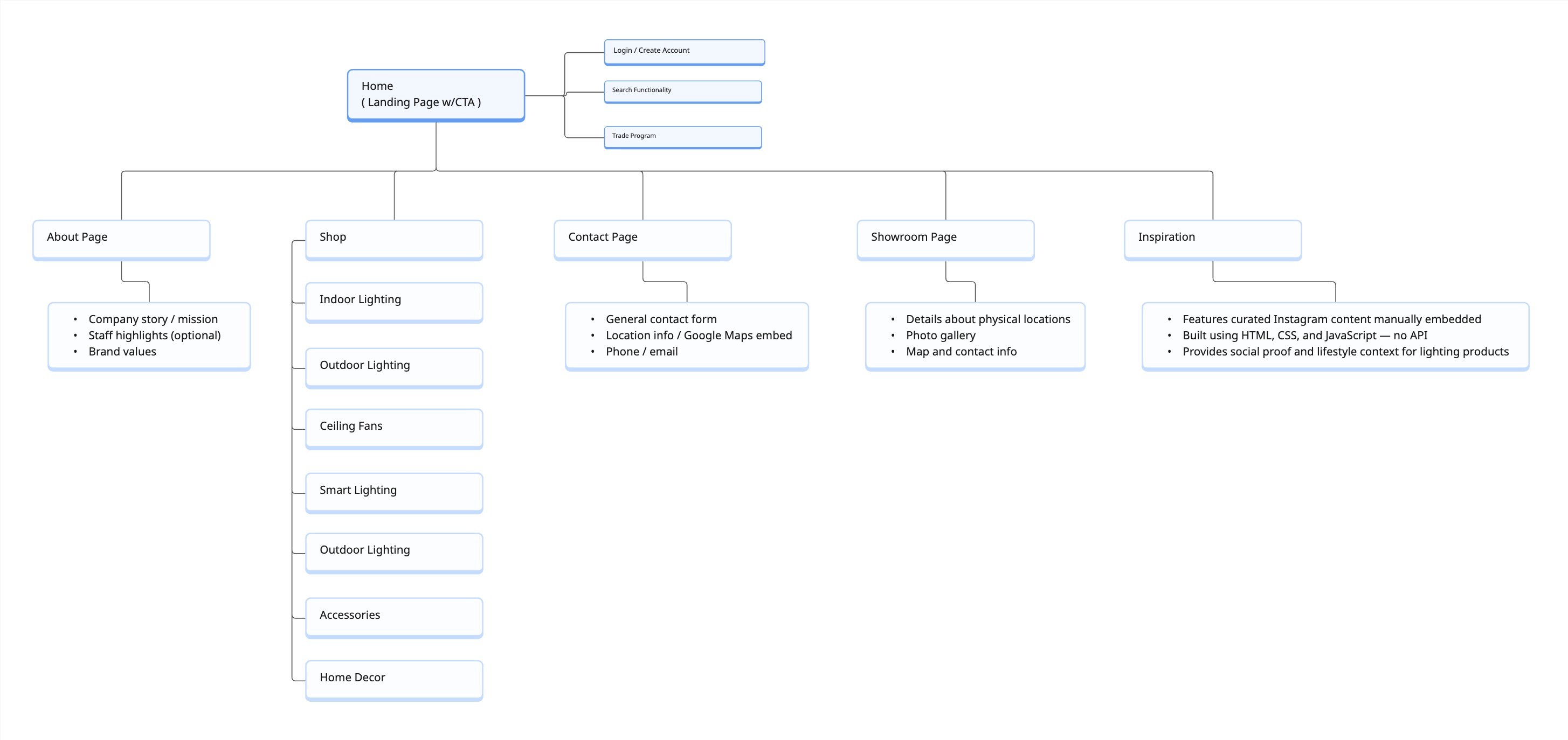
Website Architecture Overview
This sitemap outlines the core structure of the Kendall Lighting website. It was created to organize key content areas and page flows before moving into wireframes, helping align both internal teams and client stakeholders on site priorities.
Tools & Collaboration: Miro – for collaborative visual mapping • Client Feedback Sessions – to define content needs and page goals • Internal Team Alignment - to ensure dev feasibility and UX clarity
Tools & Collaboration: Miro – for collaborative visual mapping • Client Feedback Sessions – to define content needs and page goals • Internal Team Alignment - to ensure dev feasibility and UX clarity
Tools & Collaboration: Miro – for collaborative visual mapping • Client Feedback Sessions – to define content needs and page goals • Internal Team Alignment - to ensure dev feasibility and UX clarity
This sitemap outlines the core structure of the Kendall Lighting website. It was created to organize key content areas and page flows before moving into wireframes, helping align both internal teams and client stakeholders on site priorities.
This sitemap outlines the core structure of the Kendall Lighting website. It was created to organize key content areas and page flows before moving into wireframes, helping align both internal teams and client stakeholders on site priorities.
This sitemap outlines the core structure of the Kendall Lighting website. It was created to organize key content areas and page flows before moving into wireframes, helping align both internal teams and client stakeholders on site priorities.
Low-Fidelity / High Fidelity Mockups
Low-Fidelity / High Fidelity Mockups
After sketching out the overall structure of CyperSports, I jumped into Figma to start building out the low-fidelity mockups. My goal here wasn’t to focus on colors or imagery—it was more about mapping out the layout, structure, and how the content would guide users through the page. I kept things minimal, using greyscale boxes and placeholder text to visualize the flow.
After sketching out the overall structure of CyperSports, I jumped into Figma to start building out the low-fidelity mockups. My goal here wasn’t to focus on colors or imagery—it was more about mapping out the layout, structure, and how the content would guide users through the page. I kept things minimal, using greyscale boxes and placeholder text to visualize the flow.
After sketching out the overall structure of CyperSports, I jumped into Figma to start building out the low-fidelity mockups. My goal here wasn’t to focus on colors or imagery—it was more about mapping out the layout, structure, and how the content would guide users through the page. I kept things minimal, using greyscale boxes and placeholder text to visualize the flow.
Once I felt confident in the structure, I transitioned into high-fidelity mockups. That’s when I started layering in the visual identity—brand colors, fonts, actual images, and UI details that matched the tone of the site. The high-fidelity versions helped bring the concept to life and gave me a clear sense of how the final design would feel.
Once I felt confident in the structure, I transitioned into high-fidelity mockups. That’s when I started layering in the visual identity—brand colors, fonts, actual images, and UI details that matched the tone of the site. The high-fidelity versions helped bring the concept to life and gave me a clear sense of how the final design would feel.
Once I felt confident in the structure, I transitioned into high-fidelity mockups. That’s when I started layering in the visual identity—brand colors, fonts, actual images, and UI details that matched the tone of the site. The high-fidelity versions helped bring the concept to life and gave me a clear sense of how the final design would feel.

Low-Fidelity Mockup – Layout Planning
This version focused strictly on layout and spacing. It was helpful for testing structure and making quick changes before investing time into final design elements.

High-Fidelity Mockup – Final Visual Direction
This mockup incorporated color, real content, and branding elements. It reflects the look and feel of the final product and set the foundation for the development handoff.
Tools: Figma, Google Docs
Mockups were created entirely in Figma, which allowed me to move quickly from low-fidelity layouts to polished UI designs. I used auto layout and component libraries to keep things consistent, and documented key flow decisions in Google Docs to align with both the marketing team and internal developers.
Mockups were created entirely in Figma, which allowed me to move quickly from low-fidelity layouts to polished UI designs. I used auto layout and component libraries to keep things consistent, and documented key flow decisions in Google Docs to align with both the marketing team and internal developers.
Mockups were created entirely in Figma, which allowed me to move quickly from low-fidelity layouts to polished UI designs. I used auto layout and component libraries to keep things consistent, and documented key flow decisions in Google Docs to align with both the marketing team and internal developers.
Project Summary
Kendall Lighting is a Midwest-based retailer specializing in residential and commercial lighting solutions. The goal of this project was to modernize their online shopping experience, streamline product discovery, and boost customer engagement through a fresh eCommerce design. I collaborated with marketing stakeholders and the sales team to reimagine their homepage layout, refine their messaging, and restructure navigation to better guide users toward key product categories.
Kendall Lighting is a Midwest-based retailer specializing in residential and commercial lighting solutions. The goal of this project was to modernize their online shopping experience, streamline product discovery, and boost customer engagement through a fresh eCommerce design. I collaborated with marketing stakeholders and the sales team to reimagine their homepage layout, refine their messaging, and restructure navigation to better guide users toward key product categories.
Kendall Lighting is a Midwest-based retailer specializing in residential and commercial lighting solutions. The goal of this project was to modernize their online shopping experience, streamline product discovery, and boost customer engagement through a fresh eCommerce design. I collaborated with marketing stakeholders and the sales team to reimagine their homepage layout, refine their messaging, and restructure navigation to better guide users toward key product categories.
While this case study highlights the desktop design process, I also worked closely with front-end developers to ensure mobile usability and performance optimization, using insights from Google Analytics and client feedback to guide responsive improvements. My role combined UX/UI design, front-end collaboration, and data-informed decision-making, resulting in a modernized, customer-friendly website aligned with Kendall Lighting’s brand and business goals.
While this case study highlights the desktop design process, I also worked closely with front-end developers to ensure mobile usability and performance optimization, using insights from Google Analytics and client feedback to guide responsive improvements. My role combined UX/UI design, front-end collaboration, and data-informed decision-making, resulting in a modernized, customer-friendly website aligned with Kendall Lighting’s brand and business goals.
While this case study highlights the desktop design process, I also worked closely with front-end developers to ensure mobile usability and performance optimization, using insights from Google Analytics and client feedback to guide responsive improvements. My role combined UX/UI design, front-end collaboration, and data-informed decision-making, resulting in a modernized, customer-friendly website aligned with Kendall Lighting’s brand and business goals.
This is one of a few case studies from the 400+ branded eCommerce websites I helped design during my time at Lights America. Due to NDAs and out of respect for past clients, only select projects are shared publicly.
© 2025 Chris Puncekar, All Rights Reserved