Pro Tips
Best Practices for Accessibility in UI/UX Design (The Stuff That Actually Matters)
Apr 21, 2025
Over the years, I’ve had to stay on top of accessibility across a whole mess of websites — and I mean hundreds. At my last job, I was constantly reviewing pages, coordinating with developers, and making sure we were staying up to date with ADA standards. Let’s just say… we were very proactive about catching issues after they became issues. 😅
Now, with my recent CourseCareers training, I’ve gotten a clearer, more structured understanding of accessibility in UI/UX — and why it’s not just about compliance. It’s about making things actually work for everyone.
What Accessibility Really Means
Accessibility isn’t just alt text and color contrast — it’s about designing interfaces that are usable by everyone. That means thinking through how people with visual, hearing, cognitive, or motor impairments interact with your site.
A few big takeaways:
• Visual impairments: Think high contrast, scalable fonts, keyboard navigation, and screen reader support.
• Hearing impairments: Always include captions and transcripts for audio/video content. Don’t bury critical info in sound-only formats.
• Cognitive impairments: Keep layouts clean, content digestible, and navigation predictable. Don’t overload users with too much at once.
What I Learned in CourseCareers That Reinforced This
The CourseCareers UI/UX module on accessibility was super clear:
• Good accessibility improves the experience for everyone
• Inclusive design opens the door to a wider audience
• Testing is key — don’t just “eyeball” it and hope for the best
We covered not just theory, but actual hands-on tasks — like adjusting designs for better readability, reviewing video walkthroughs, and identifying real-world flaws in UX decisions.
Real Talk: Just Do the Basics (And Do Them Well)
You don’t need a massive overhaul to start making your site more accessible. A few key best practices go a long way:
• Use proper HTML structure — headings, labels, landmarks
• Don’t rely solely on color to convey info
• Add alt text to every image (yes, even the boring ones)
• Keep interactive elements like buttons and links easy to focus and navigate
• Make sure your font sizes and spacing don’t require a magnifying glass
Final Thought
At the end of the day, accessibility isn’t just a checklist — it’s a mindset. It’s about building experiences that don’t leave people behind. Whether you’re a designer, dev, or somewhere in between, incorporating accessibility from the jump just makes sense.
And yeah, it saves a lot of headaches later too.
Bonus: Clean Code Helps Everyone (Yes, Even Accessibility)
Something that doesn’t get talked about enough — writing clean HTML and CSS is low-key a huge accessibility win.
It’s not just about developer pride or “clean code vibes.” Proper heading structure (<h1>, <h2>, etc.), semantic tags (<nav>, <article>, <main>, <footer>), and well-labeled forms all help assistive technologies like screen readers understand your site better.
If your markup is a total mess with divs inside of divs inside of sadness, accessibility takes a hit. Clean syntax = better structure = better experience for everyone. It’s honestly one of the easiest, most overlooked ways to make your website more inclusive — and bonus: it’s easier to maintain and scale, too.
So yeah, write that code like someone else might actually have to use it. Because they will.
Tool I Use Daily: My Go-To Contrast Ratio Checker
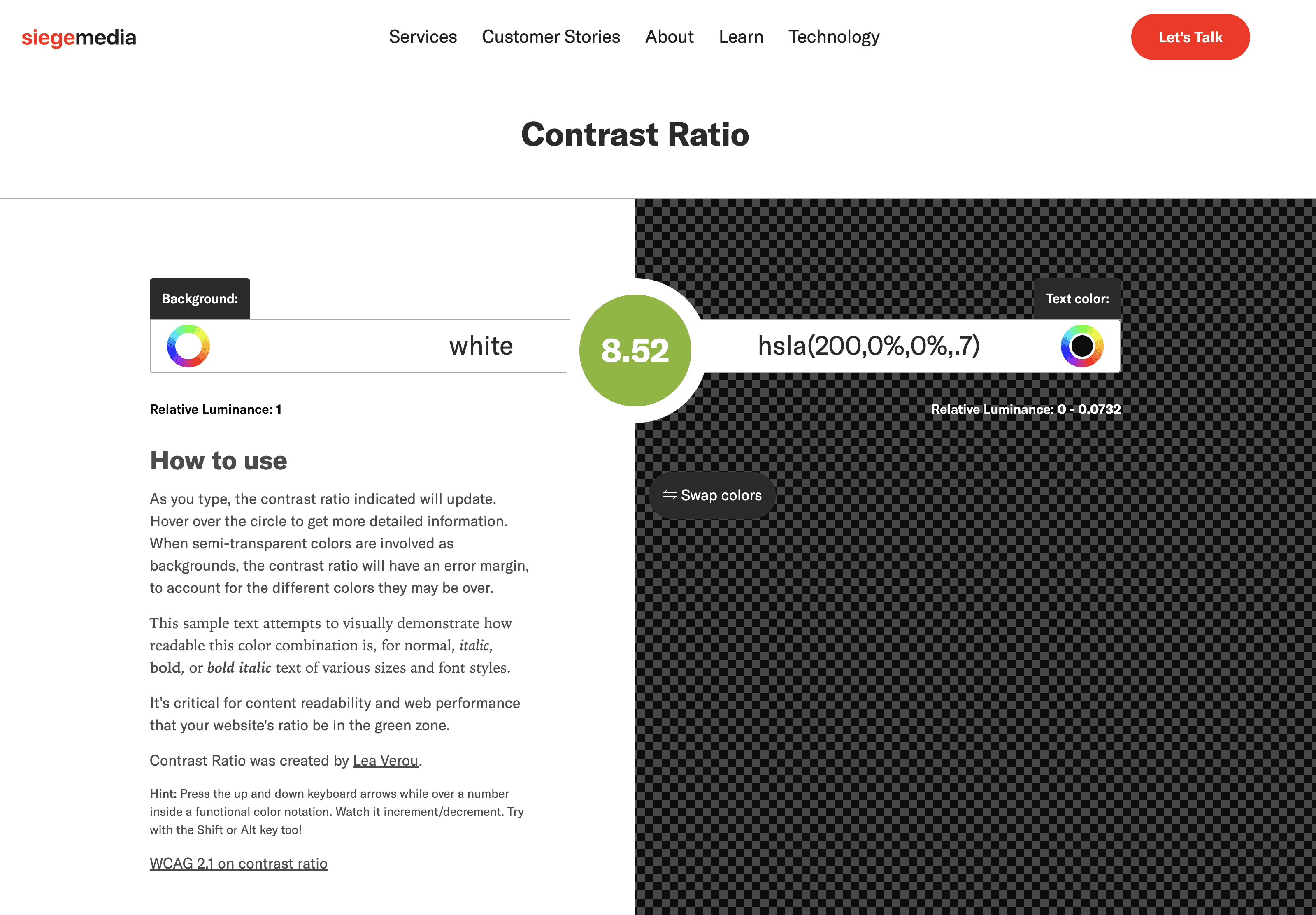
When I’m designing or writing anything meant to go on the web, I’m constantly checking contrast — and my favorite tool for that is Siege Media’s Contrast Ratio Checker.
It’s fast, simple, and gives you a live preview of how readable your color choices actually are. You just type in your background and text colors, and it tells you if you’re hitting the right ratios for AA or AAA accessibility standards.
It even works with semi-transparent colors and gives you the exact contrast score so you’re not just eyeballing it. Super helpful when you’re designing something in Figma, working on CSS, or even just picking colors for a blog or ad.
I use it more than I’d like to admit — especially when I think a color combo looks fine, and it turns out to be a total accessibility fail 😅
Tool I Use Daily: Able (for Figma)
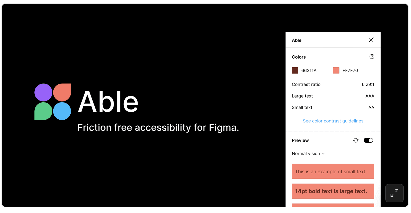
I actually first heard about Able during the CourseCareers UI/UX course, and it’s been in my Figma workflow ever since.
It makes checking accessibility super simple — contrast ratios, color blindness previews, all that good stuff. Just select two layers, and Able instantly tells you if the contrast passes or fails. No clunky setup, no digging through menus. It just works.
It’s one of those plugins that quietly levels up your design quality without slowing you down.
Tool I Use Daily – WAVE: Web Accessibility Evaluation Tool
WAVE is hands down one of my favorite tools for catching accessibility issues directly in the browser. I’ve literally used it a million times (ok maybe not quite a million but I used it every time I've built a website) across different projects — it’s my go-to for spotting things like missing alt text, low contrast, or incorrect heading structure.
What makes WAVE so great is that it runs entirely locally — no data is sent to a server — which means I can safely test password-protected pages or even local development builds. It evaluates the rendered page too, so it catches dynamic content issues that other tools might miss.
It’s fast, lightweight, and super effective — an essential in any accessibility-focused workflow.
🔗 WAVE Chrome Extension →
Try CourseCareers – The Real Deal
If you’re trying to learn UI/UX and want a clear, practical, and self-paced course, CourseCareers has been awesome. It breaks everything down into steps, and I’ve already used what I’ve learned in real projects — like this one.
It’s not sponsored — just my honest take. Worth checking out if you’re serious about learning UX.
👉 Explore the CourseCareers UI/UX Program