E-commerce
My Role
UX/UI Designer, Brand Strategist, Web Developer
Project Dates
2025
Live Project
The Problem
The Solution
Full Project Stack
Tools: Shopify • Shopify Liquid • Figma • Photoshop • Adobe Illustrator • Salesforce Tableau • Framer
Design Skills: Visual Design • Branding • Typography • Color Theory • Accessibility & Empathy • Responsive Design • E-commerce Optimization
UX Methods: UX/UI Design • User Research • User Testing • Task Flows • Wireframing • Prototyping • Project Planning • Heuristic Evaluation • A/B Testing
Live Project: Diamond Luxe Co.
01 Research
Tools: Salesforce Tableau Public, Google Forms, Microsoft Excel, Figma
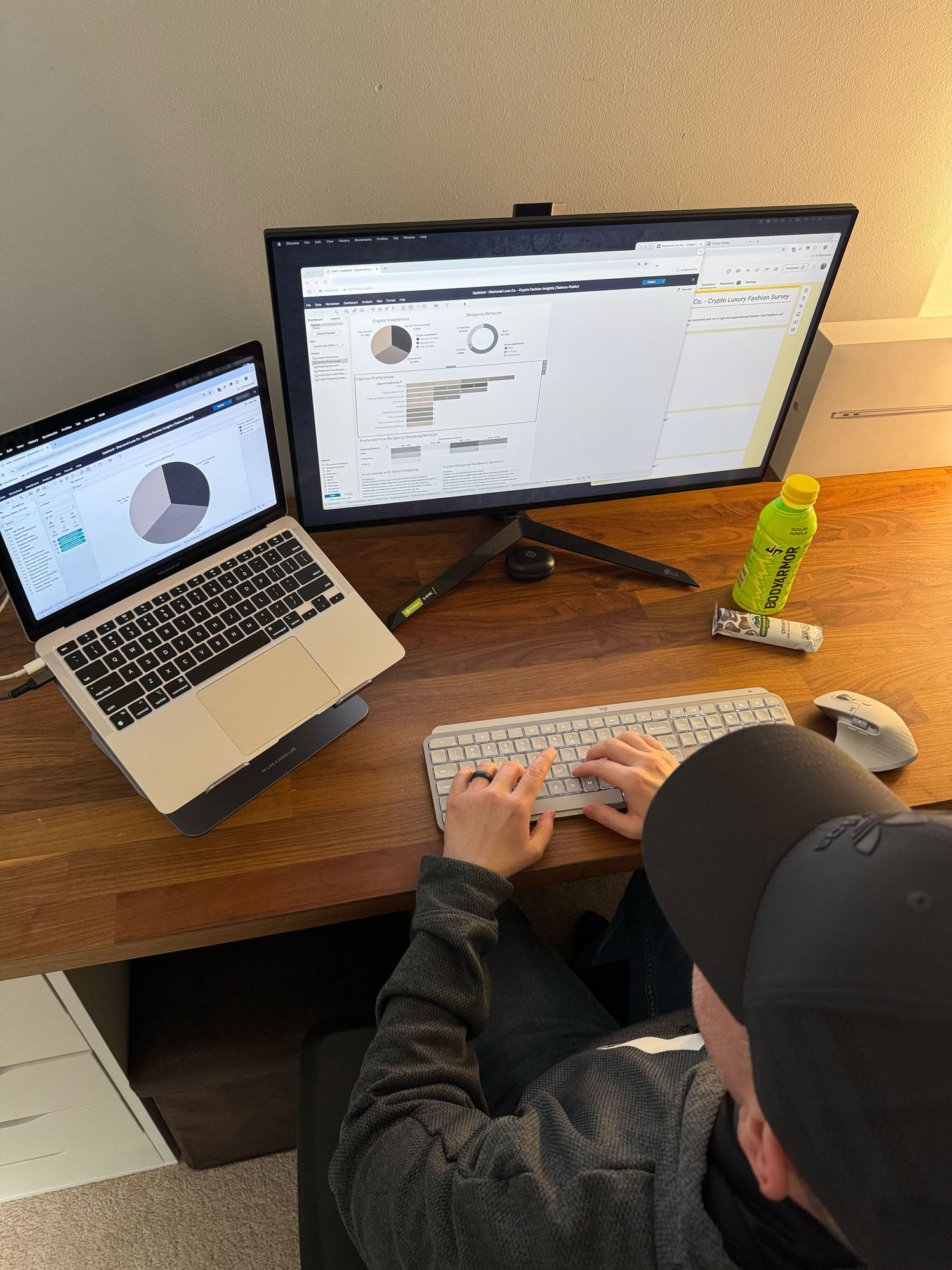

Behind the Scenes:
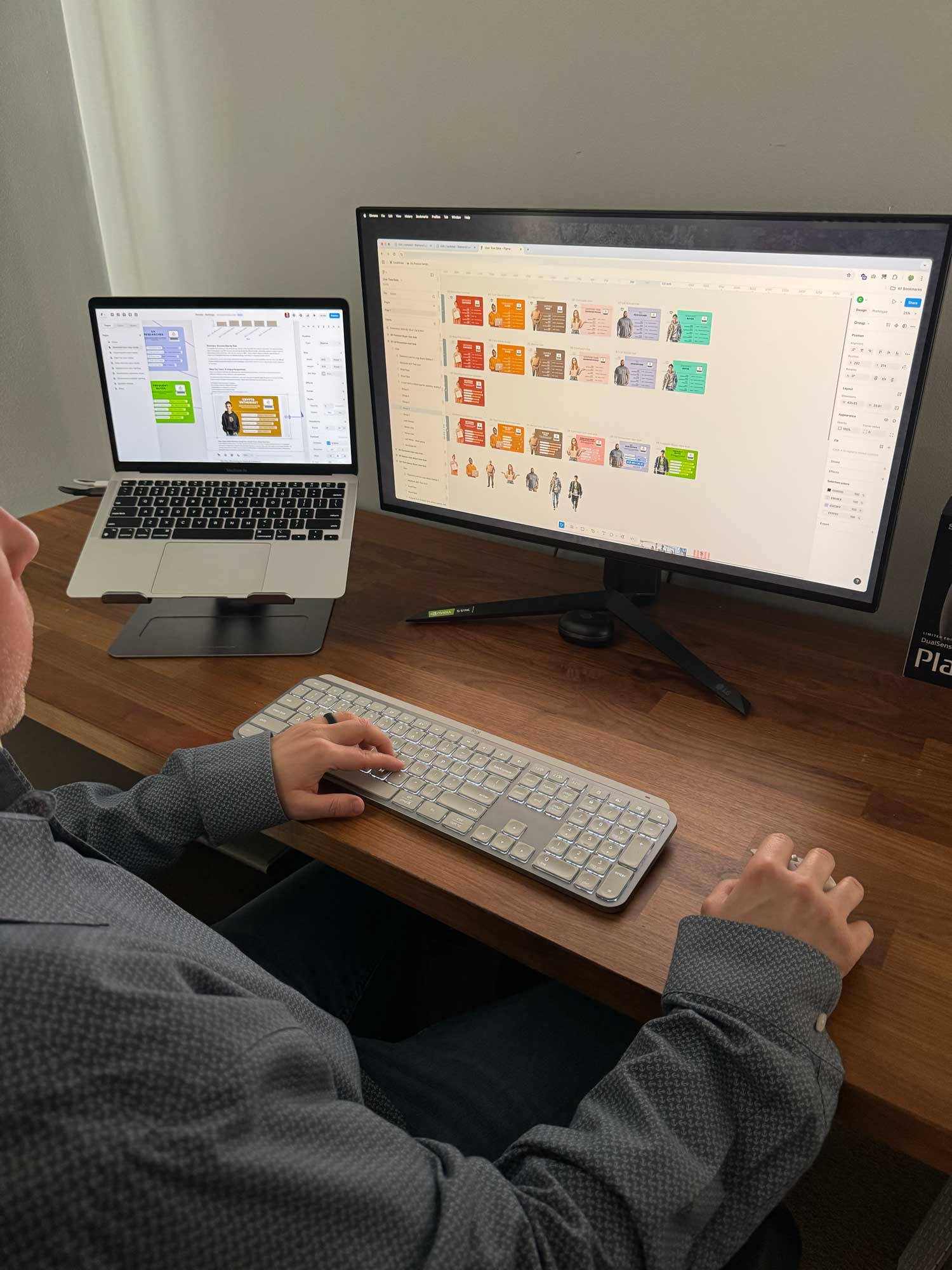
Affinity Map: Synthesizing User Insights
Organizing qualitative survey responses into key patterns of user behavior, pain points, and innovation opportunities.


Tools: Figma, FigJam, Microsoft Excel


Behind the Scenes:
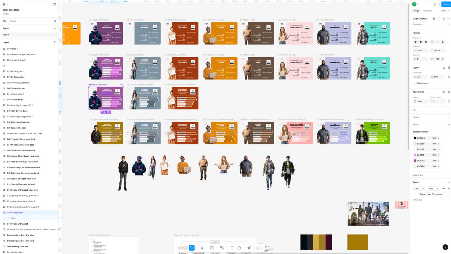
To better connect with our audience, I created detailed user personas based on survey data and industry research. These personas represent the core mindsets driving crypto fashion shoppers — from high-risk investors to design-savvy early adopters. Each profile helped me stay focused on real user needs, from payment preferences to style expectations, while making sure the brand stays aligned with what matters most to them.


Tools: Google Forms, Google Docs, Figma, FigJam, Adobe Photoshop, Adobe Illustrator


Behind the Scenes:
After pulling key insights from the survey and affinity mapping work, I created user personas to better represent the different types of people shopping in the crypto fashion space. I focused on their goals, frustrations, spending habits, and how they view style. This helped me think more clearly about who I was designing for — not just as numbers on a chart, but as real people with preferences, pain points, and expectations. It also gave me a reference point throughout the project to stay aligned with the user mindset.
After pulling key insights from the survey and affinity mapping work, I created user personas to better represent the different types of people shopping in the crypto fashion space. I focused on their goals, frustrations, spending habits, and how they view style. This helped me think more clearly about who I was designing for — not just as numbers on a chart, but as real people with preferences, pain points, and expectations. It also gave me a reference point throughout the project to stay aligned with the user mindset.

Tools: Google Forms, Google Docs, Figma, FigJam, Adobe Photoshop, Adobe Illustrator
I used Google Surveys to collect initial user data, then organized and synthesized key themes in Google Docs and FigJam. Personas were designed and refined in Figma, with supporting visual elements created in Photoshop and Illustrator to maintain a polished, branded look.
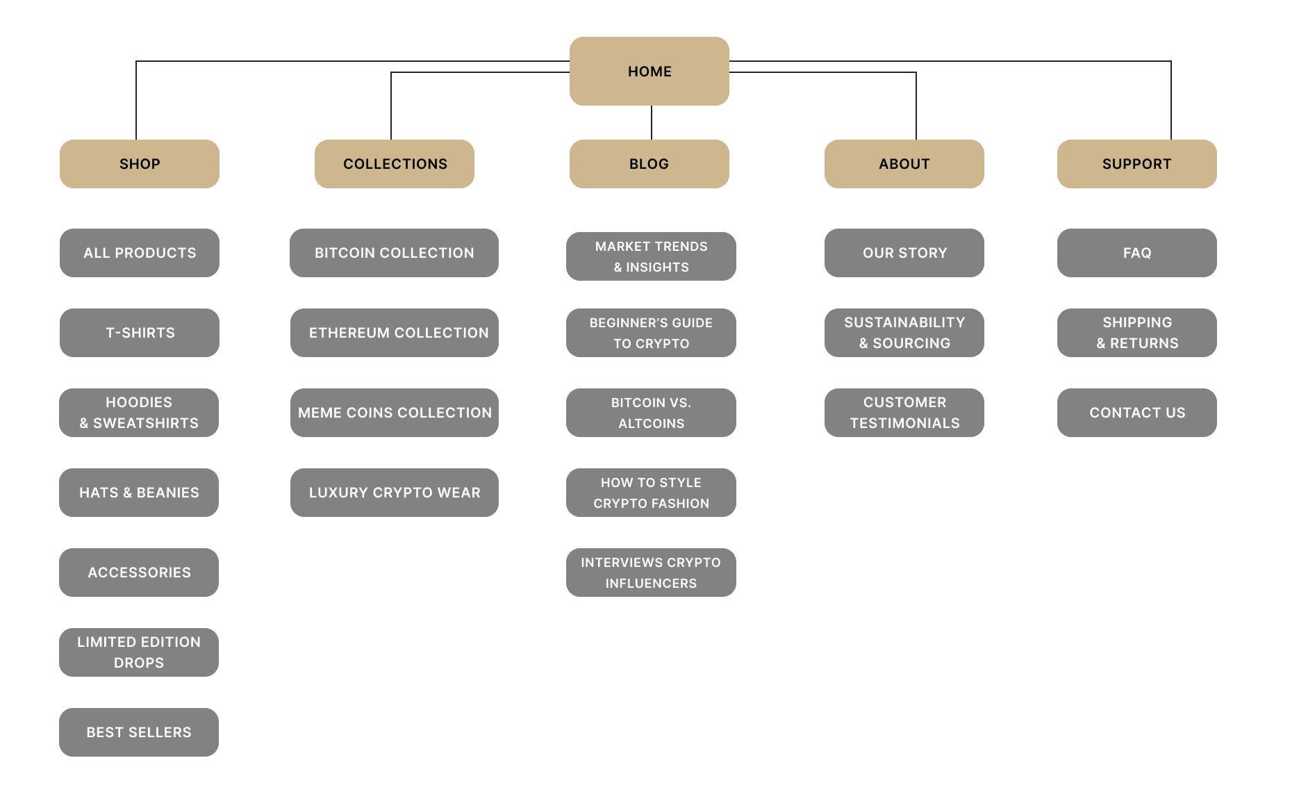
Card Sorting: Organizing Content Around User Expectations


Success Rate by Task
Success Rate by Task
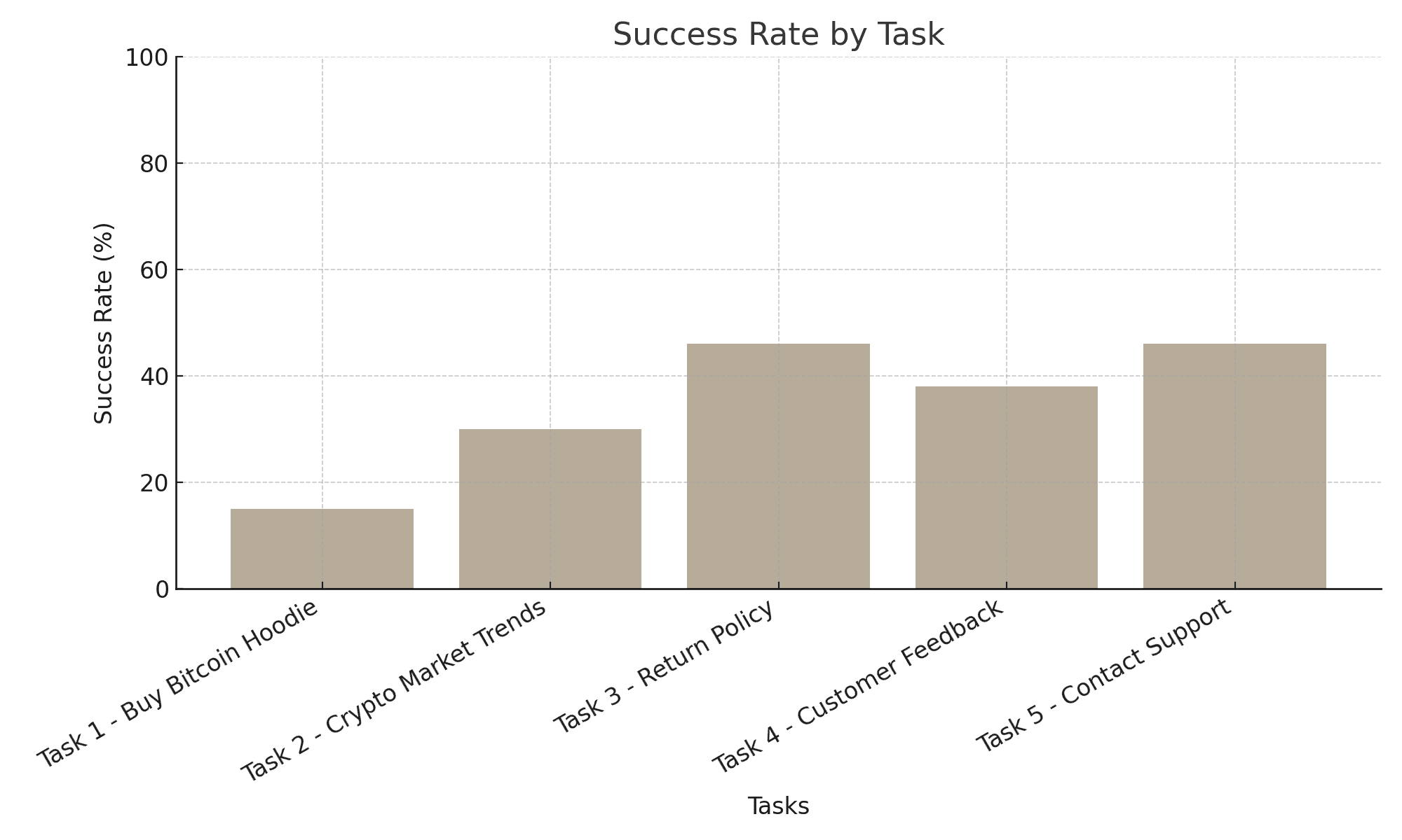


Behind the Scenes:
Tools: Figma, Adobe Illustrator (layout refinement)
I used Figma to structure the site map and visually organize the hierarchy of Diamond Luxe Co.’s pages. Illustrator may have been used to fine-tune layout elements or export the final graphic, keeping the visual style aligned with the brand’s overall aesthetic.
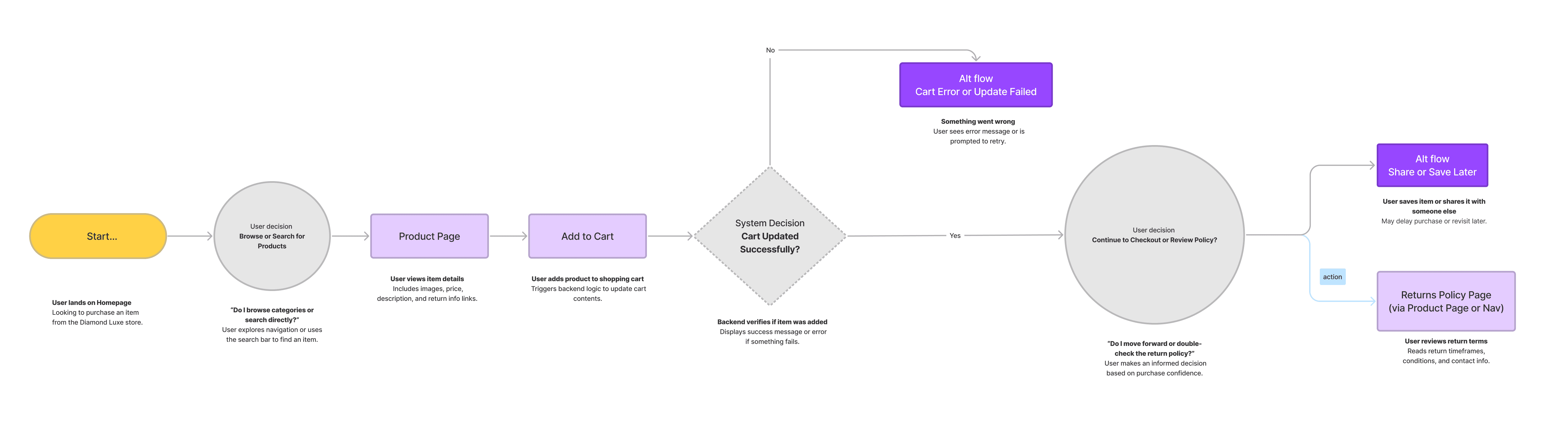
03 Interaction Design
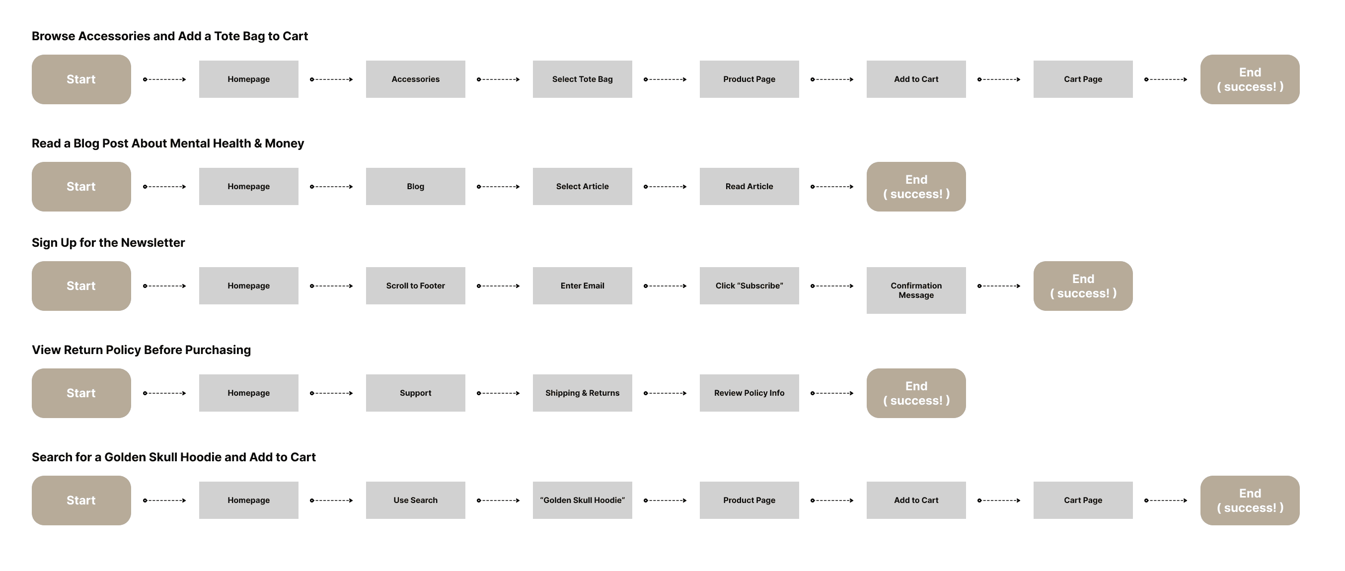
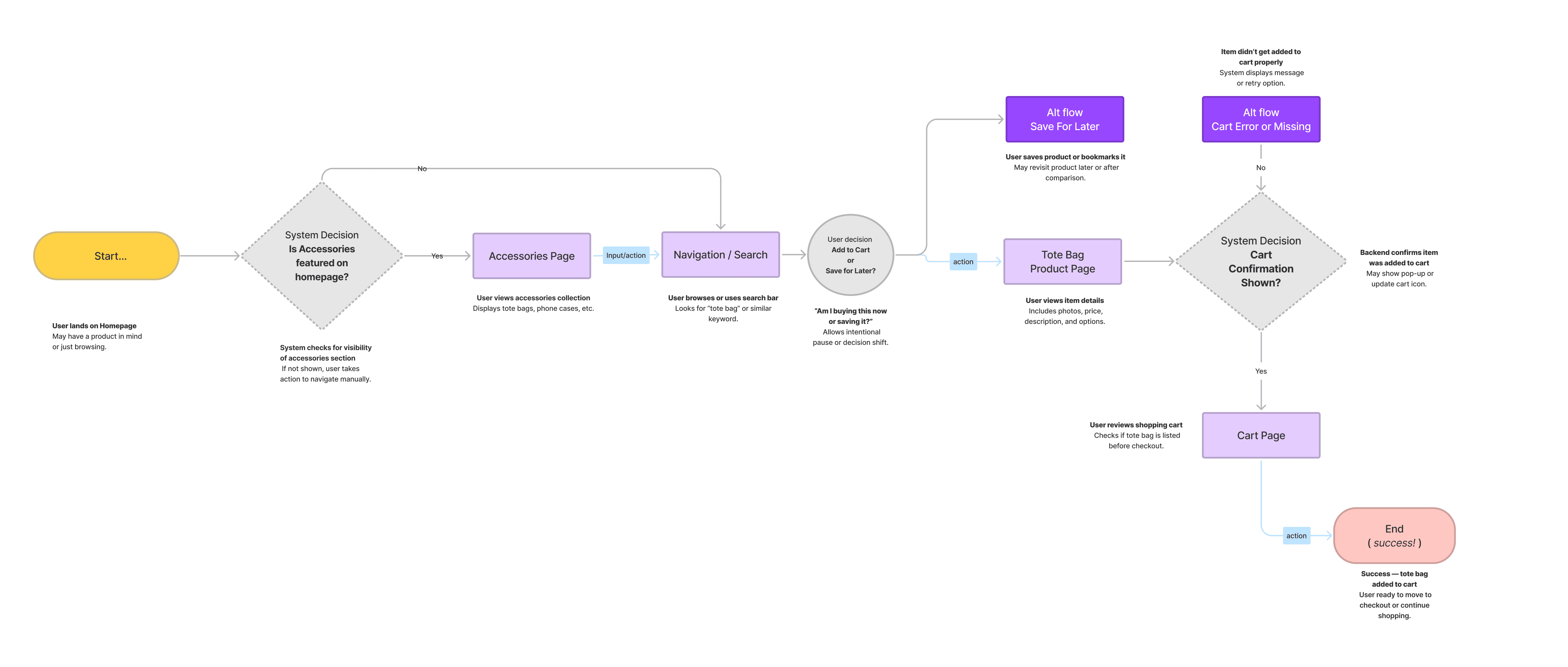
You can check out the task flow in the embed right here — no Figma account needed.
Use the zoom or fullscreen buttons to dive in and explore the UX choices.
Summary
Tools: Figma, FigJam

04 Visual Design
Visual Design
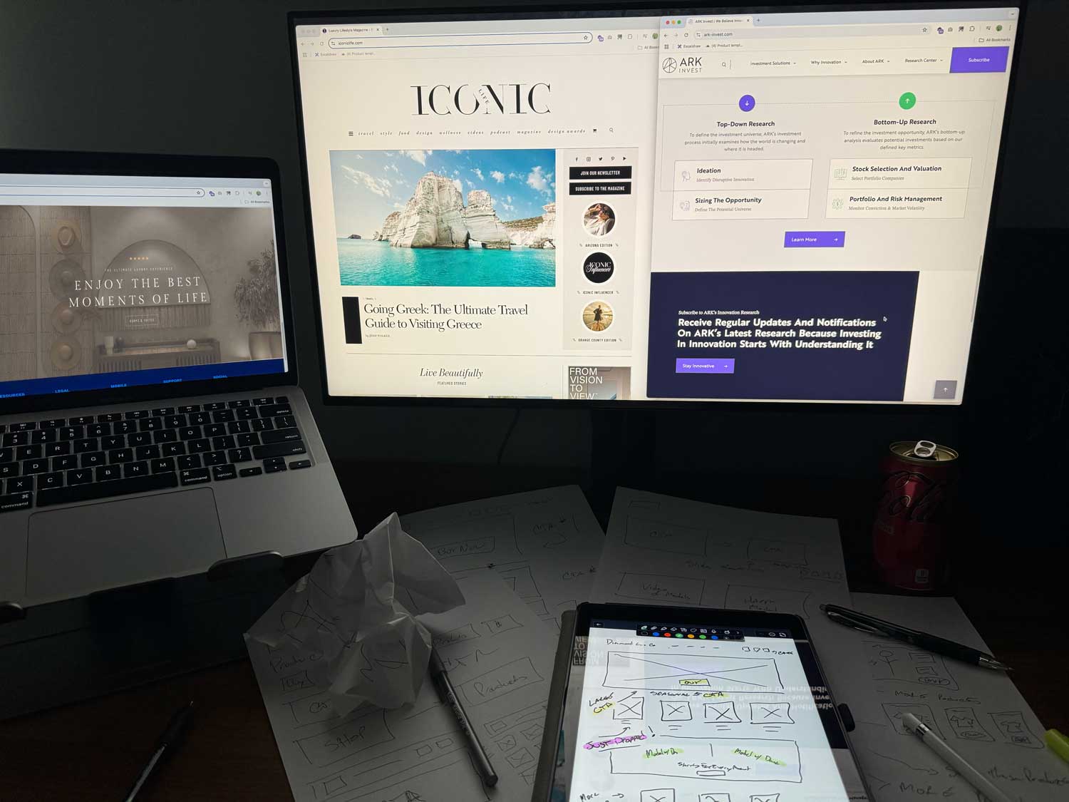
To begin visualizing the layout and structure of Diamond Luxe Co., I started by ideating on paper with pencil and micron pen(s) to explore layout variations and core user pathways. These initial sketches helped shape the foundation of the homepage design.
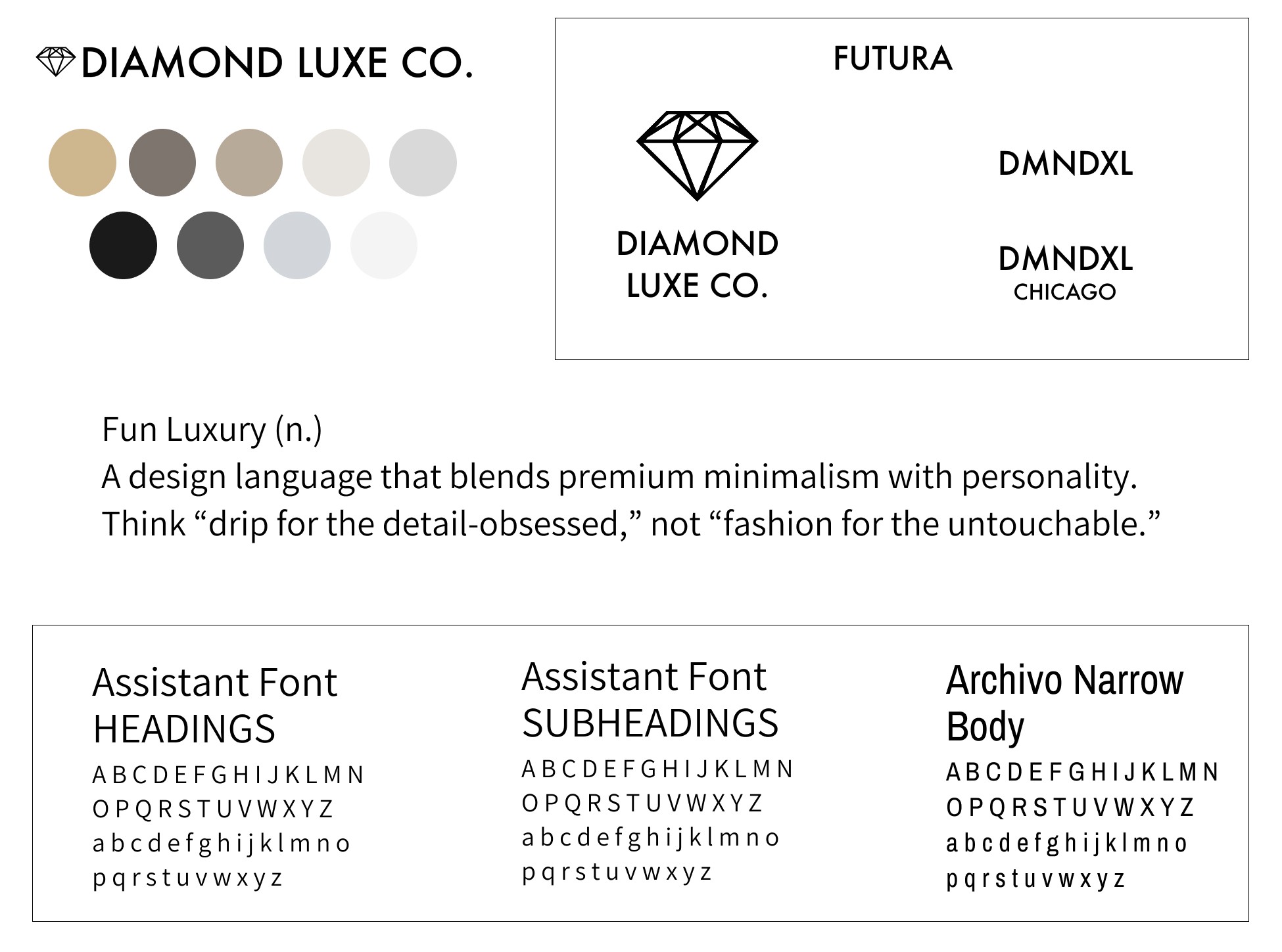
Brand Aesthetic: Fun Luxury
Fun Luxury (n.)
A design language that blends premium minimalism with personality.
Think “drip for the detail-obsessed,” not “fashion for the untouchable.”
Where Fun Luxury Was Born


Tools used: Pen, Paper, Sketching, Inspiration, Mood Boards

Tools: Midjourney, Adobe Photoshop, Figma
To capture the right look and tone, I drew inspiration from top crypto and fintech websites in the U.S., including Coinbase, Kraken, Gemini, and Binance US. I focused on clean, modern UI patterns and branding that felt futuristic yet trustworthy — the kind of style today’s crypto audience already connects with.
Once the brand’s visual identity was defined, I created a simple, focused media kit to package the key elements: the logo system, color palette, brand typography, and tone statement. This media kit serves as a foundational asset for future marketing, collaborations, and outreach efforts — ensuring that every visual touchpoint remains consistent with the Diamond Luxe Co. brand. Keeping the layout clean and minimal allowed the luxury aesthetic to stand out while maintaining flexibility for future expansion.
Media Kit
Behind the Scenes - Sketching


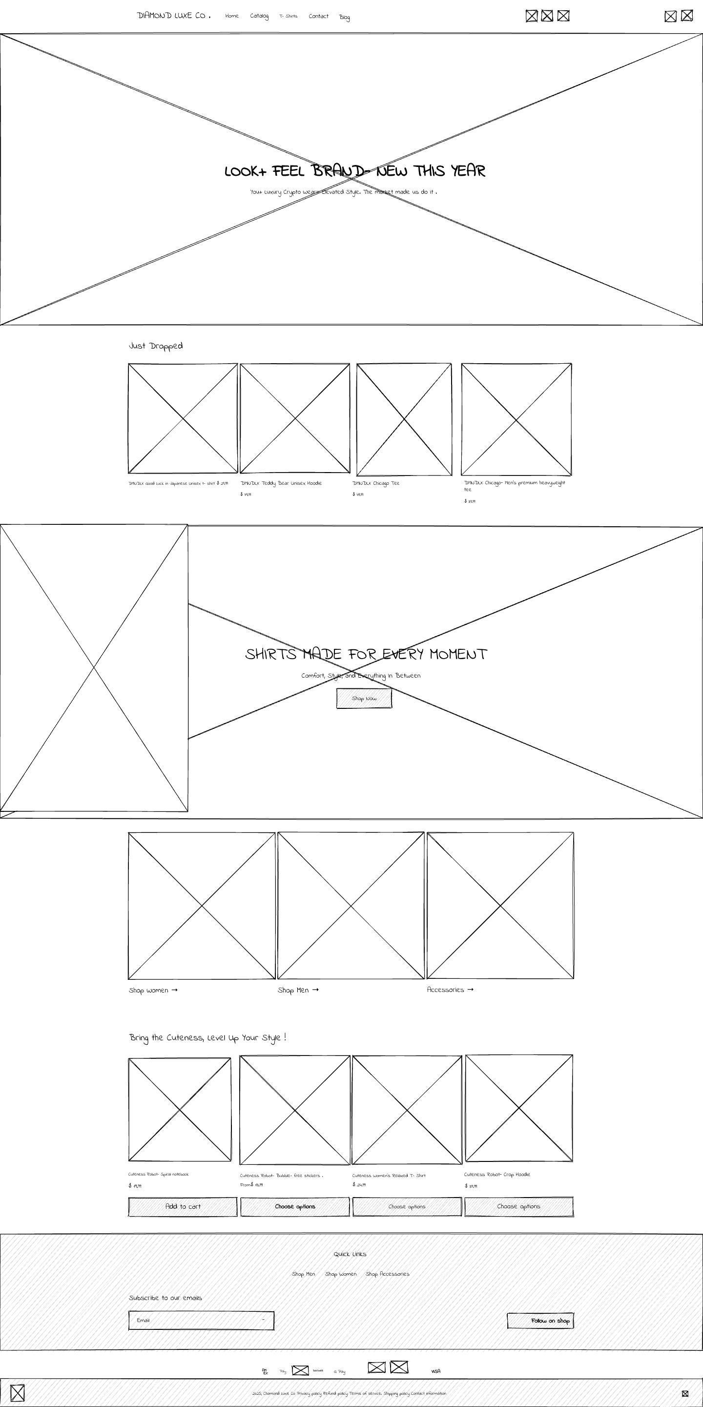
Wireframes

Wireframe Layout – No Text
This version focuses solely on the structural layout and visual hierarchy without the influence of copy, allowing for a clean, content-neutral review of the design’s spatial flow.
Wireframe Layout – With Sample Text
A refined version of the layout including placeholder headlines, subtext, and product descriptions to demonstrate how real content will interact with the design and guide the user experience.
Low-fidelity Mockups

Very Low-Fidelity Mockup – Skeleton View
This version refines the sketch into a structured layout with placeholders and basic product text. It helped me get a clearer sense of spacing, navigation, and content alignment across the homepage.
Low-Fidelity Mockup – Simplified Layout
A minimalist layout with light styling and text included for clarity. It focuses on structural decisions and core UX flow without getting deep into design details. This step helped me ensure the layout made sense visually and functionally before adding any brand styling or imagery.
Low-Fidelity Wireframes: Mapping the Foundation
Before jumping into visuals or branding, I created a series of low-fidelity wireframes to establish the core structure and flow of the site. This step allowed me to focus purely on layout, content hierarchy, and functionality without getting distracted by color, typography, or imagery. It served as a blueprint for the rest of the design process — helping me validate the user experience across homepage, product listings, and cart flow before committing to high-fidelity visuals.

Low-Fidelity Mockup to High-Fidelity
After mapping out the core layout in low-fidelity wireframes, I transitioned to high-fidelity mockups using real photography, branding elements, and product visuals. This helped bring the luxury and crypto-inspired tone of Diamond Luxe Co. to life.
Tools: Google Docs, Figma
Strategy Shift: From Custom Code to Shopify
TL;DR:

Prototyping

Prototyping for customer checkout
This version refines the sketch into a structured layout with placeholders and basic product text. It helped me get a clearer sense of spacing, navigation, and content alignment across the homepage.
Checkout Steps
Scroll through the homepage to find the
DMNDLX Teddy Bear Unisex Hoodie
Click the hoodie to view the Product Detail Page
Select your size and click “Add to Cart”
In the popup, click “Checkout”
On the Cart page, confirm your item and
click “Checkout” again
Enter contact & shipping info in the
checkout form
Select a payment method and place the order
Land on the Order Confirmation page with
a summary + tracking
Order is Confirmed, Yay!
Accessibility wasn’t an afterthought for Diamond Luxe Co. — it was baked into every design decision from the start. Using tools like Figma, Shopify, Color Contrast Checker, and Google Lighthouse, I prioritized inclusive design practices that make the site usable for as many people as possible.
*Quote is from Antony Conboy UI/UX Designer

Able – Friction-Free Accessibility Plugin for Figma
Able is a lightweight accessibility plugin that allowed me to quickly test contrast ratios between layered elements in Figma. By selecting two layers — such as text over a background — I was able to instantly verify WCAG compliance for both small and large text. The plugin’s simple preview and vision simulation options helped ensure the site remained accessible to a wider range of users.

Figma’s Built-in Color Contrast Checker
Figma’s own Color Contrast Checker helped me validate accessibility directly within my design workflow. I used it to verify that all critical foreground and background color combinations passed AA and AAA compliance for both text and UI elements. Its clear pass/fail indicators and WCAG alignment ensured I maintained visual clarity across all user interfaces.
How I Made the Site More Accessible
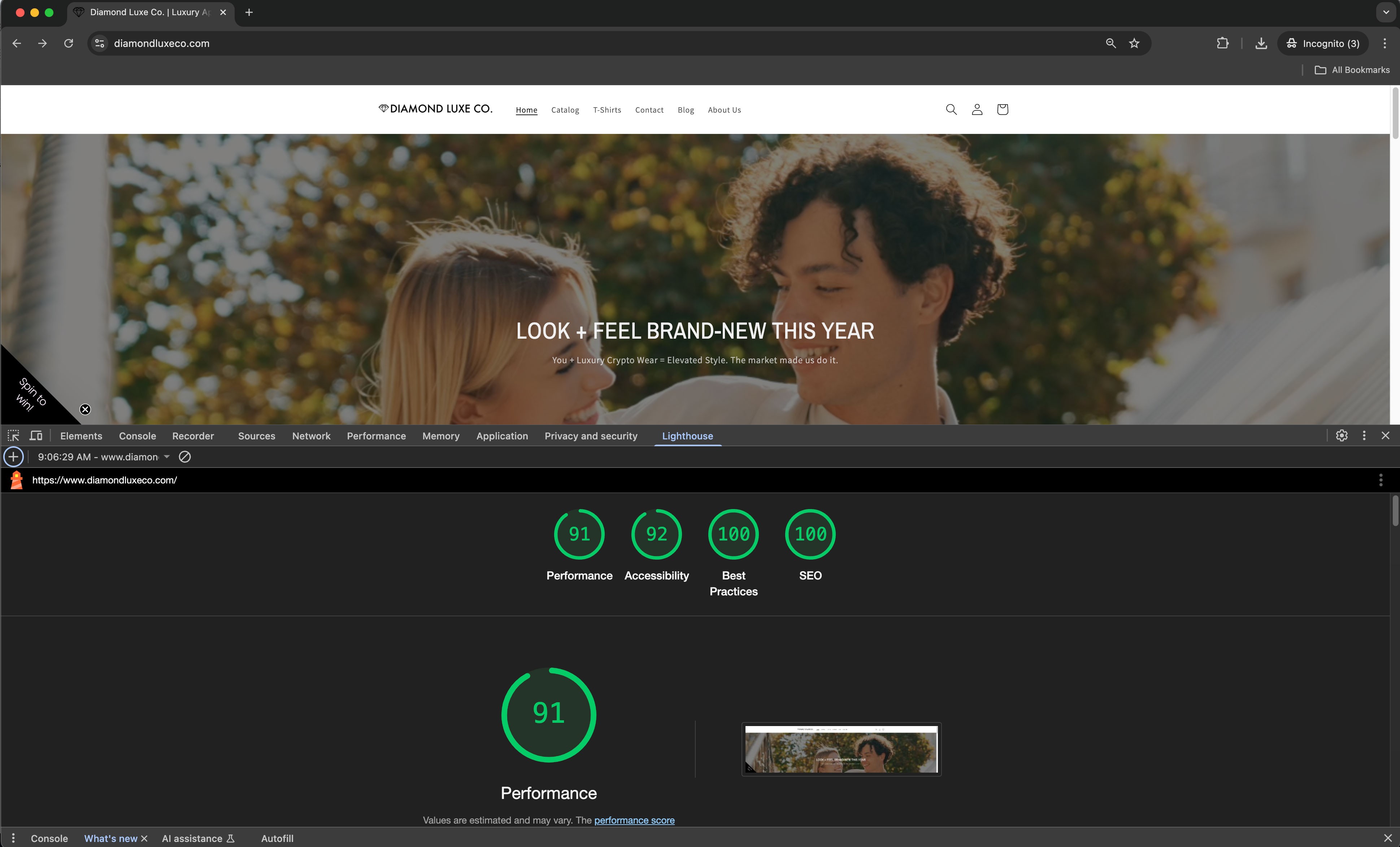
Accessibility Testing with Google Lighthouse
This screenshot captures the official Lighthouse audit results for the Diamond Luxe Co. homepage. The site earned a 92 in Accessibility, along with perfect scores (100) in both SEO and Best Practices. These metrics validate the use of proper HTML structure, contrast ratios, and semantic design throughout the Shopify build.
Tools: Figma, Color Contrast Checker, Shopify, Google Lighthouse
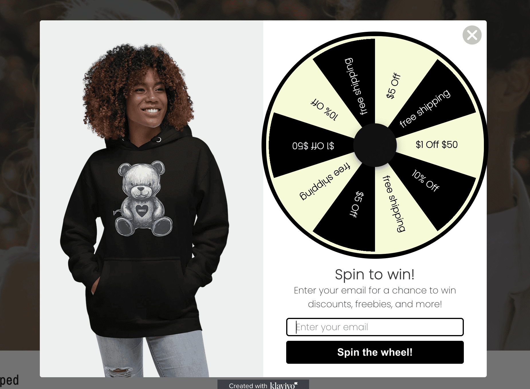
Popup window using klaviyo integrated with Shopify
I integrated Klaviyo with Shopify to create an interactive popup experience that encourages email signups while maintaining accessibility standards. The spinwheel offers users a chance to win discounts and free shipping incentives, helping drive engagement without disrupting the shopping flow. The popup design is fully responsive, ADA-conscious, and optimized for both desktop and mobile visitors.
06 Testing and Improvements
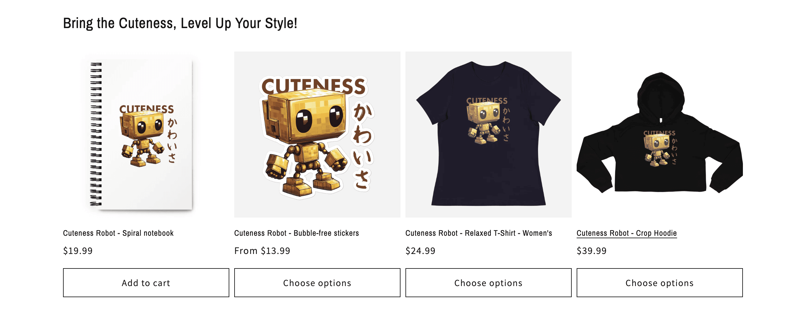
BEFORE - Original Homepage Feature: Cuteness Robot
The Cuteness Robot collection was originally featured on the homepage as a product spotlight. While the designs were well-received, I realized the aesthetic leaned too playful and didn’t match the luxury, finance-forward tone I wanted Diamond Luxe Co. to project at first glance. It clashed slightly with the overall brand vibe and made the homepage feel less cohesive.
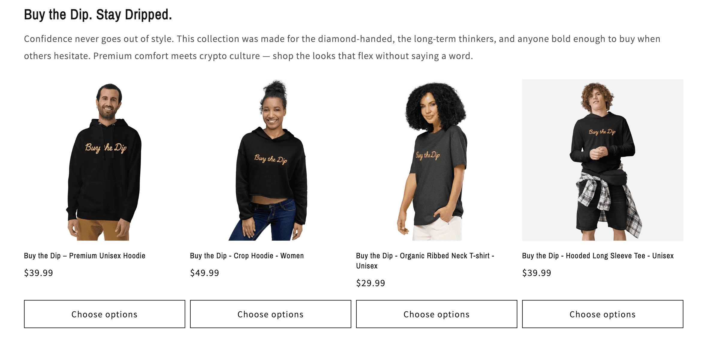
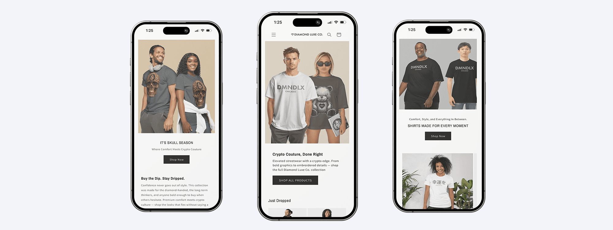
After - Updated Homepage Feature: Buy the Dip
To better align with the brand’s minimalist, high-end style, I replaced the Cuteness section with the Buy the Dip collection. This new product set feels more aligned with the tone and message of Diamond Luxe Co. — sleek, direct, and designed for confident crypto investors. The updated visuals deliver stronger cohesion and reflect a clearer brand identity.
BEFORE – Homepage Hero Missed the Mark
The original homepage hero featured a stock-style image and vague tagline that felt off-brand for Diamond Luxe Co. While clean and neutral, it lacked personality and failed to represent the luxury crypto streetwear vibe the site was meant to convey. The tone was too generic, leaning lifestyle over identity, and didn’t speak to our target audience — crypto investors and high-end buyers looking for a sharper, more curated experience.

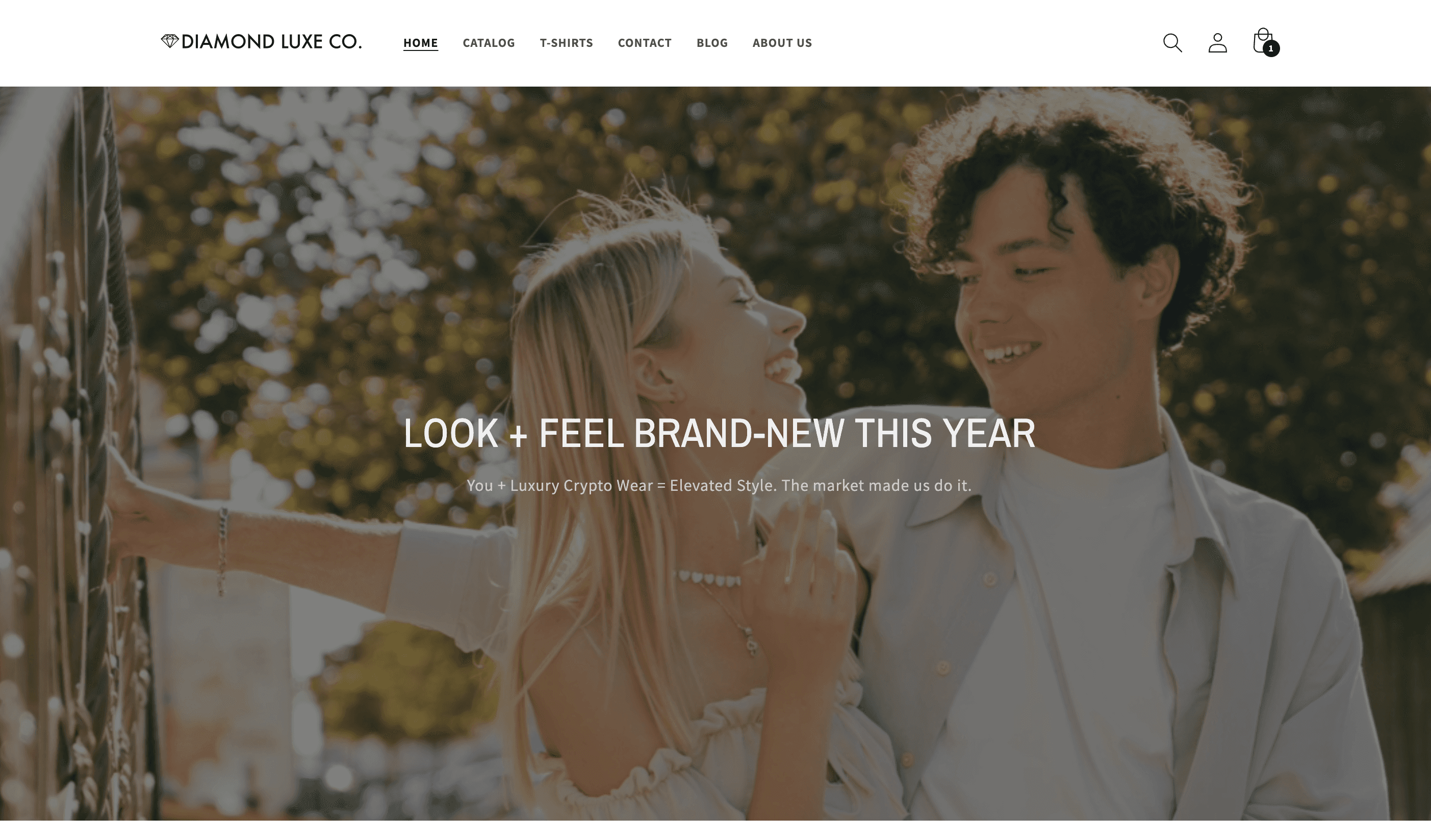
After - Updated Homepage Hero — Buy the Dip Collection
To better align with our luxury crypto fashion aesthetic, I replaced the header with a bold, editorial image from the Buy the Dip collection. The new design feels more premium and better communicates our brand identity—sleek, confident, and investor-minded. It also delivers greater visual cohesion and clarity across the full user experience.

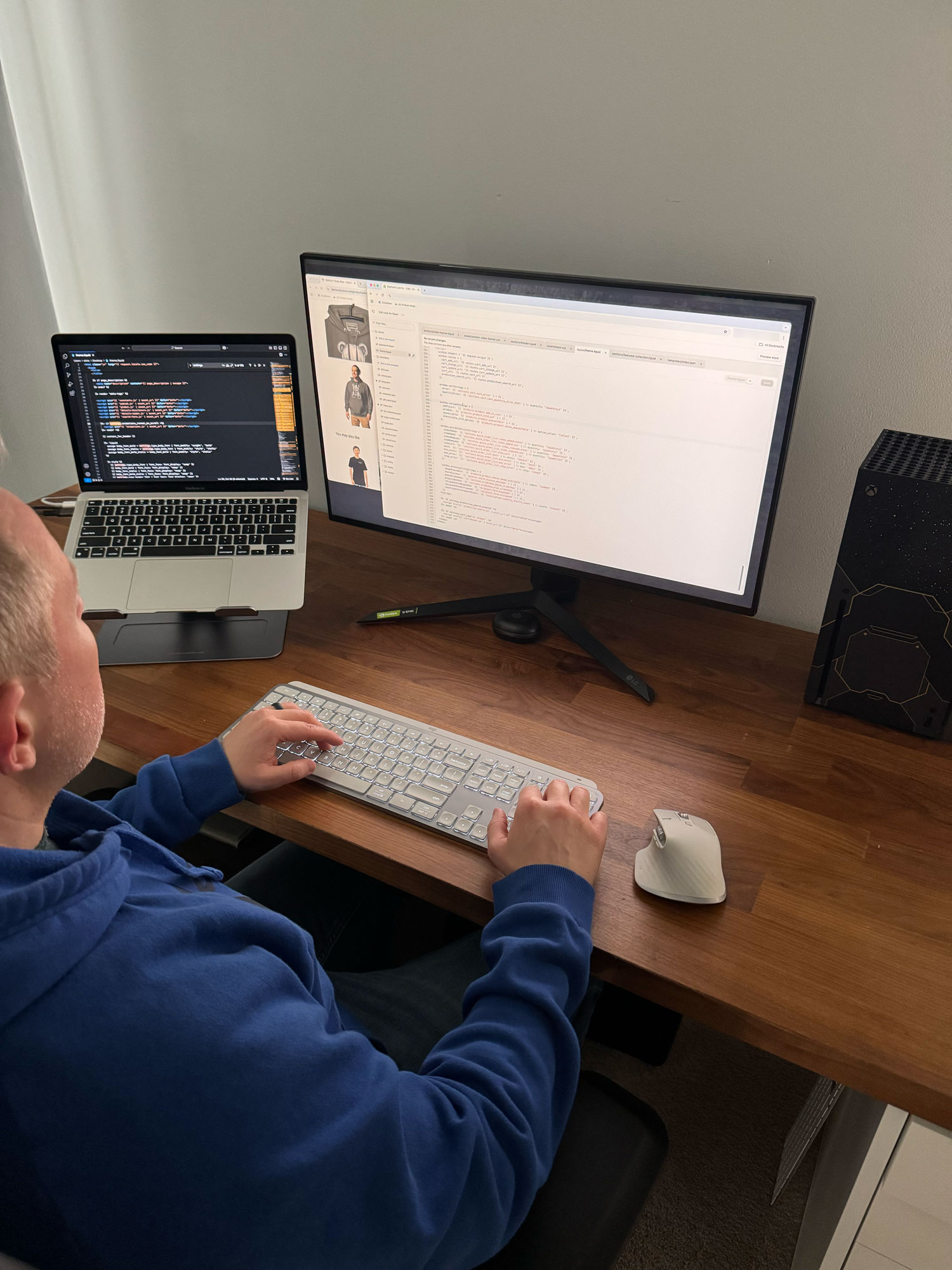
BEFORE – Homepage Hero Didn’t Match the Vision
This behind-the-scenes image shows the active redesign of the Diamond Luxe Co. homepage hero section in Figma. After realizing the original layout didn’t reflect the brand’s upscale, crypto-investor vibe, I reworked the visual structure and replaced the generic hero with a stronger, more aligned aesthetic. The goal was to elevate the experience, clarify the brand’s premium tone, and deliver a design that matched the product offering and target audience — bold, sleek, and finance-forward.
07 Summary
Case Study Summary
🎥 Case Study Walkthrough: Diamond Luxe Co. UX & Shopify Build
This video walks through the full UX process behind Diamond Luxe Co.—from early research and wireframes to final Shopify implementation. You’ll see design decisions explained, homepage and collection changes in action, and the accessibility improvements that helped the brand feel more polished and user-friendly.
What's Next >>
Creating the Diamond Luxe Co. Collection

Building the Real Website on Shopify
Customizing the Live Shopify Experience
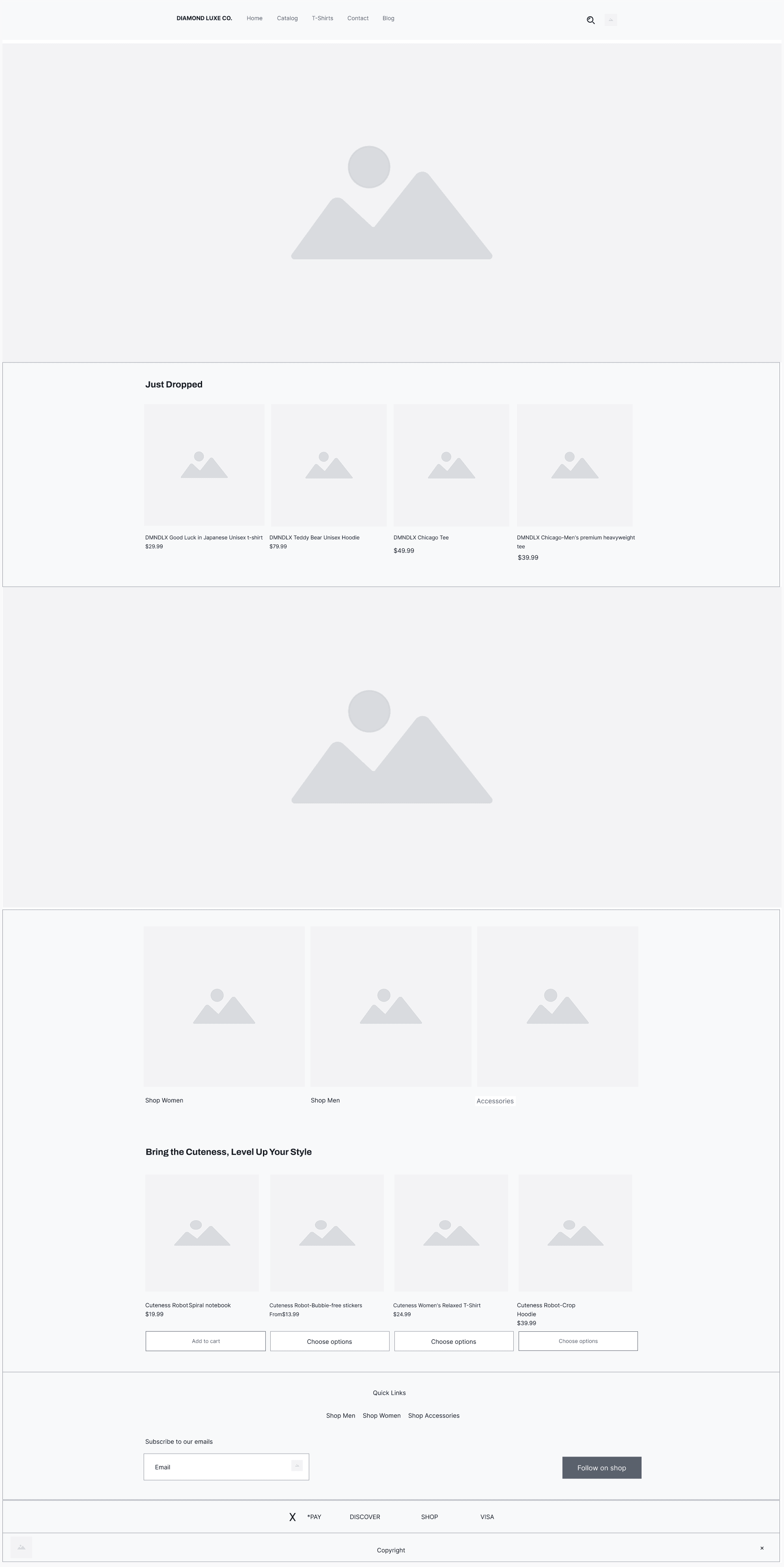
To bring Diamond Luxe Co. to life online, I customized the Shopify Dawn theme using a combination of built-in settings and direct Liquid code edits. This allowed me to tailor the site’s design, improve the structure for SEO and accessibility, and ensure the shopping experience aligned with the brand’s premium, minimalist style. Building a live store added another layer of real-world execution to the project — moving beyond prototypes into functional design.
If You Made It This Far—Thank You!
© 2025 Chris Puncekar, All Rights Reserved